Even after almost 20 years, you can still find a tidbit here or there about the poster online.
Producing an infographic:
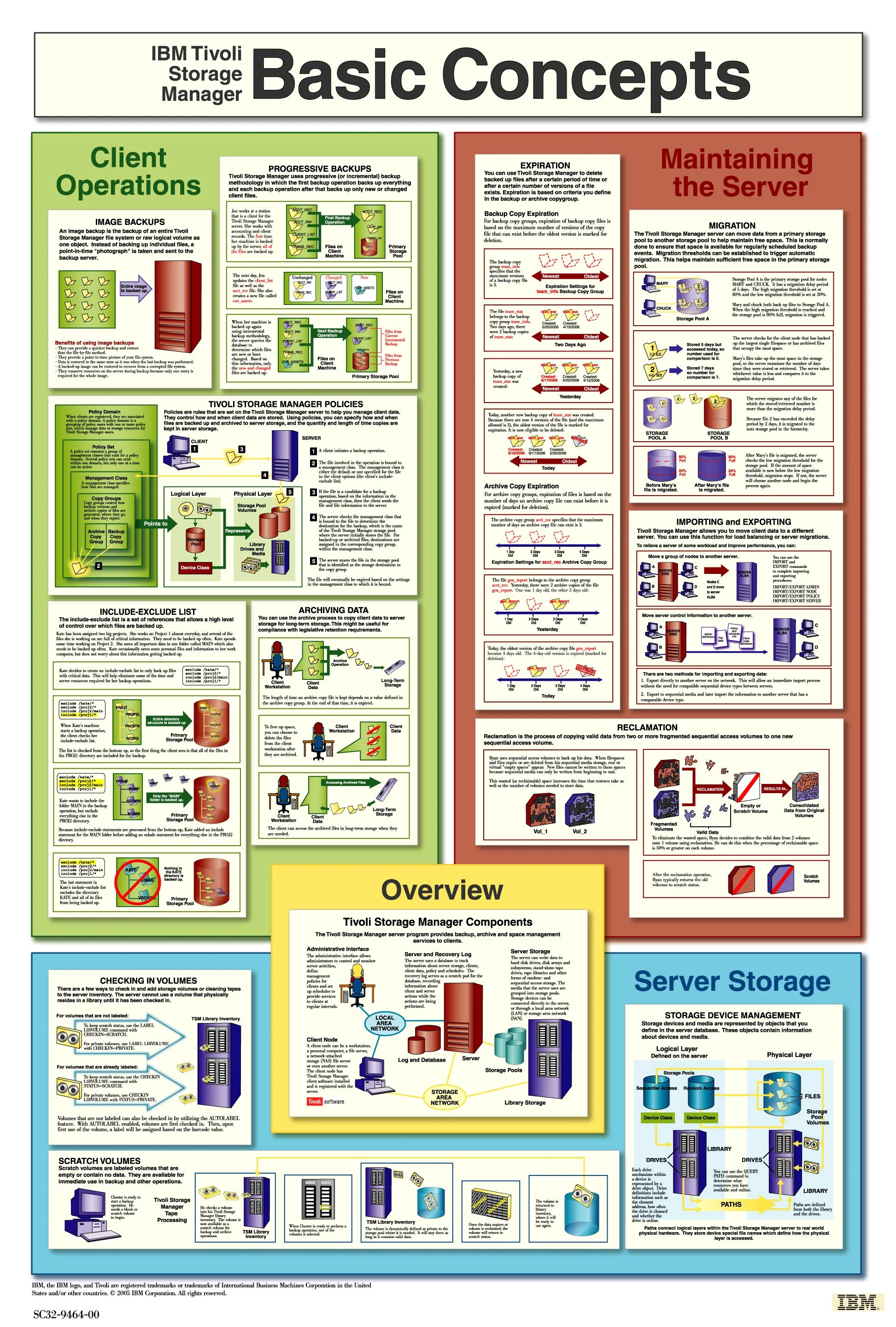
Tivoli Storage Manager Basic Concepts poster
Summary
Around 3 years into my tenure on the Tivoli Storage Manger information development (ID) team, I got the opportunity to lead a special project: creating a poster aimed at boiling down some of the product’s key concepts. This was a pivotal experience for me, eventually leading to a part-time graphic designer role on the team and my later move into the design organization.
Problem & user needs
IBM Tivoli Storage Manager (later rebranded to Spectrum Protect and currently Storage Protect) is a backup and recovery solution that provides centralized, automated data protection to help reduce data loss and manage compliance with data retention and availability requirements. The product has deep functionality but it’s difficult to convey the value in a nutshell. We wanted to create something fun and engaging that could provide an introduction to the product’s capabilities.
Role
Project, ID, and graphic design lead working with an ID intern, development, and test teams on concepts, documentation, and testing
Key contributions
Along with development and our offering management teams, helped narrow down product concepts into a focused list.
Drafted ideas for infographic visualizations and validated functionality with development and test teams.
Lead the poster design and layout effort.
Along with our intern, created digital images in Adobe Illustrator.
Coordinated with translation teams to make the poster available in other languages.
Outcome & impact
We created a 24×36” sized poster to help educate potential new clients and provide some swag to our existing users. The Sales team also used the poster during client engagements.
Presenting Tivoli Storage Manager in a visualization that showcased the products’ star capabilities and concepts helped current and potential users quickly understand the use cases for our product. In addition, we got some free advertising out of it.
The story
In early 2005, a few years after I joined the Tivoli Storage Manager server ID team full time, an idea was born to try and create a poster that would help explain the best features of our product. As I had already weaseled my way into working on technical diagrams for the documentation, I was tapped first to explore the idea of creating a poster that we could give to potential new users as well as existing customers. We had recently hired a technical writing intern, Andrea Acosta, and she came on board to help me as she also had graphic design skills and was interested in the project.
The first step was to identify which concepts we wanted to focus on and then how to illustrate them without getting overly complicated and losing users’ focus. I spent several months working closely with development and project managers to decide how we wanted to organize the information and which concepts we should deep dive on. We settled on sectioning the poster into 4 main areas that covered the bulk of the product’s capabilities. Next, we focused on what concepts within those areas should be explained.
Once we had a list, I researched using our existing documentation to draft “concept shorts,” aiming to gauge how difficult it might be to explain each thing. From there, we sketched picture ideas and reviewed them with development and product managers to ensure accuracy in the explanations and determine if we were focusing on the right aspects.
Early draft notes and sketches on the backside of printout cover sheets:


After several reviews and verifying the scenarios with our test teams, we narrowed down the list and started creating the images in Adobe Illustrator. Up to this point, our team used CorelDraw for all graphics in the manuals. Touting it’s advantages and superiority, Andrea pushed for Adobe Illustrator so we were able to get licenses just to do the poster work. I got a crash course in how to use it and the differences with CorelDraw and ended up a lifelong convert. Unfortunately we went right back to CorelDraw once the poster project concluded.

Building the images in Adobe Illustrator, refining content, and experimenting with color (20 years later, it’s a bit of a cringe-fest looking back!)

After settling on the final layout design and colors (which weren’t my favorite) we painstakingly added all of the individual graphics to the super sized poster and sent it off to be published. The poster was a huge success and an enormous learning opportunity for me. Getting to focus that much on graphics for a solid period of time really solidified my interest in digital art and drove me to continue expanding my skills and role as the department’s graphic designer. The poster won a Distinguished Engineer Award and was a unique new asset in helping potential customers understand our product’s far reaching capabilities.
Final poster design in an alternate color scheme: