Applying a Design System from the content design perspective
Summary
In IT Automation software at IBM, several of the products in our portfolio are acquisitions. When a product is acquired by IBM, part of the integration process is ensuring that it meets our branding and accessibility standards by applying Carbon, IBM’s open source design system. Depending on the product, this can be a complicated and lengthy endeavor. While Carbon has lots of guidance for the interaction and visual aspects of UI elements, the content guidance is not always as robust or clear. In addition, the design-side is largely focused on updating visual aspects first (grid layout, icons, colors) as this can sometimes be more straightforward than reworking the UX and content. As an acquired product, this process for IBM Instana Observability definitely fell into the lengthy endeavor category.
Benefits
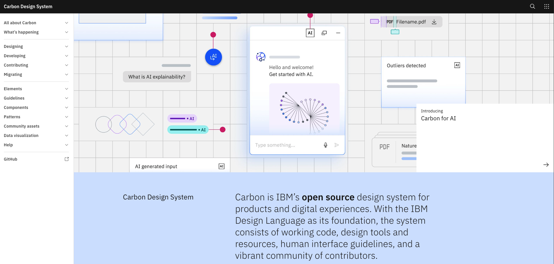
The Carbon Design System, which translates IBM Design Language into a presentation of brand and visual standards, not only unifies how customers see and interact with our software, but provides consistency for how teams design and implement digital experiences for that software. In addition to achieving a consistent and common look, feel, and function for products in the same portfolio, Carbon saves time and money by providing both designers and developers with vetted components to plug into their designs and code and common patterns to model interaction flows. Carbon components are also accessible, allowing teams to stay compliant with IBM Accessibility standards.
Role
Lead UX content designer working with one brand new content designer and ~12 UX and visual designers
Key contributions
Worked closely with Carbon adoption design team, attending weekly meetings, answering content questions, and providing content feedback.
Regularly synced with Carbon leads to plan strategy and review progress on Carbonizing for content.
Completed extensive UI content audits to identify content issues with respect to Carbon implementation.
Worked closely with development to implement a scripting process for batch changes to apply sentence-case capitalization changes.
Drafted content-specific guidance on how to apply Carbon components and patterns for create flows in Instana; Led review efforts to align across leads and stakeholders and share progress with content teams across our portfolio.
Outcome & impact
The UX content team:
Reviewed over 11,000 strings to help ensure our sentence-case capitalization script was changing words accurately.
Audited 11 sections in the UI to evaluate for voice and tone, terminology, grammar, style, and consistent application of components where content was key (such as button labels, tooltips, modals, etc.).
Provided feedback and ideas for UX improvements related to content.
Created a reference for content consistency guidance which will save teams time and ensure consistent application of content in components and patterns.
Carved out a space for content design to have an official spot in the Carbonization process.
Through continued involvement and exploration of how best to evaluate and address Carbon content deficiencies, our team forged a strong role for content design as a key player in the migration process on Instana.
The story
I joined the Instana design team as their first full-time UX content designer in the spring of March 2024 when their Carbon adoption journey was well underway. Working on Instana has been my first acquisition product and exposure to this process, especially from the content perspective. Shortly after onboarding, I learned about Carbonization and that my UX content team (myself and our content-designer-in-training, Sofia Ivanova) would need to own some of the migration work items around content.
Sentence-case capitalization
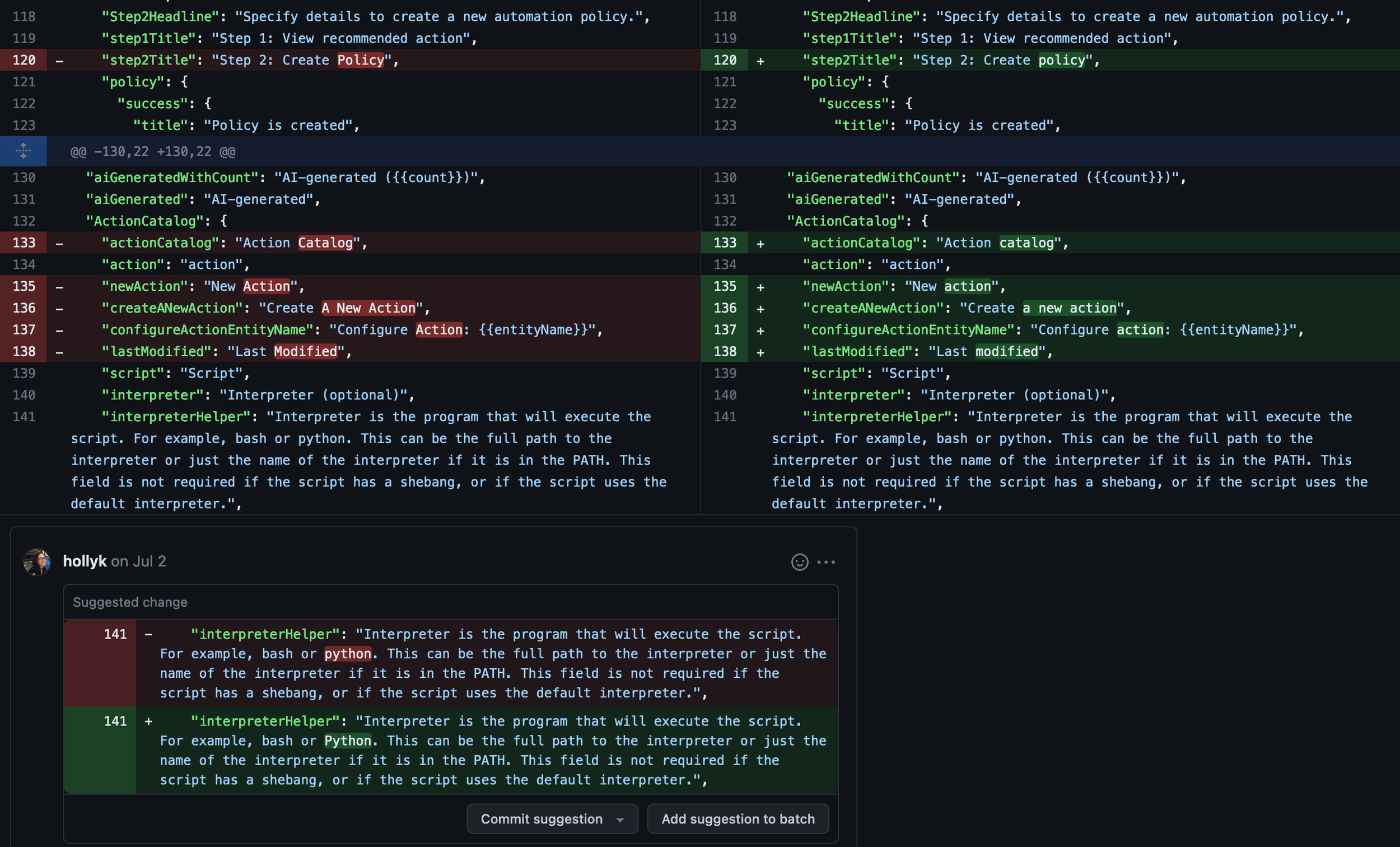
One of Carbon and IBM Style’s most prominent content rules is using sentence-case capitalization. This was a big problem across Instana and I found out would be one of the first things I needed to help work on. There wasn’t really a plan or previous strategy to use as a guide, so the Carbon team met with us to brainstorm ideas. One thought was to try using a script that could update all occurrences but Nick Vargas, our lead developer, wasn’t sure if it would work so testing would be needed.
To start, we wanted to figure out which parts of the UI were heavily impacted and might be good places to test a script. Sofia and I split up the UI to try and do a quick evaluation using Figma. We captured screens in each part of the UI and then simply highlighting where we saw issues. This worked pretty well and we quickly had some candidates to test. The script ended up working nicely but we did have to review every string to make sure that it wasn’t changing things incorrectly and that we had the right rules and exclusions in place when running it. It took some trial and error but we were able to get through the majority of the UI and implement the changes in our testing environment to review before releasing.
Carbon rules for capitalization:

Identifying capitalization problem areas in Figma:
Script output review to make sure we weren’t inadvertently changing capitalization incorrectly:
UI section audits
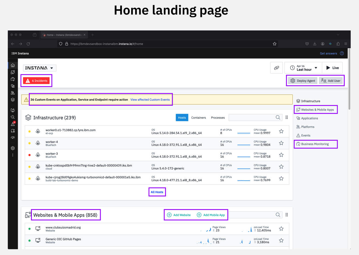
After we’d established a good cadence for reviewing output from the sentence-case capitalization script, we began tackling more comprehensive reviews for Carbon content issues - everything from voice and tone to hyphens. This was also a trial and error process. We again started in Figma but realized that was going to be more difficult. We had a lot of items to assess for (see full list below) and when we tried to split them up by category there were way too many overlaps. We would end up reviewing the same section in the UI multiple times to try and check off all of the boxes. After realizing Figma probably wasn’t going to work, I came up with a Box note idea to split up the sections in the UI based on the navigation and log all Carbon content issues for each screen in one place versus trying to log them by category. This got a little tedious and definitely took time but it seemed to work well for comprehensive evaluations. Once we finished a section, we’d review the feedback with the design team and get input. Our audits were then rolled up into the design team’s wider audits of the UX and visual issues and taken into consideration once the detailed Carbonization work got underway.
Figuring out the most efficient way to review content across the UI (abbreviations & acronyms, contractions, possessives, pronouns, spelling, commans, dashes, ellipses, hyphens, periods, quotes, slashes, symbols, currency, date & time, numbers, citations, headings, labels, lists, messages, notes, parallelism, terminology, writing style/UI personality, content clarity & consistency).
We tried to log by category in Figma….


But eventually settled on tallying all issues in one view by UI section in a Box note:


Content consistency guide
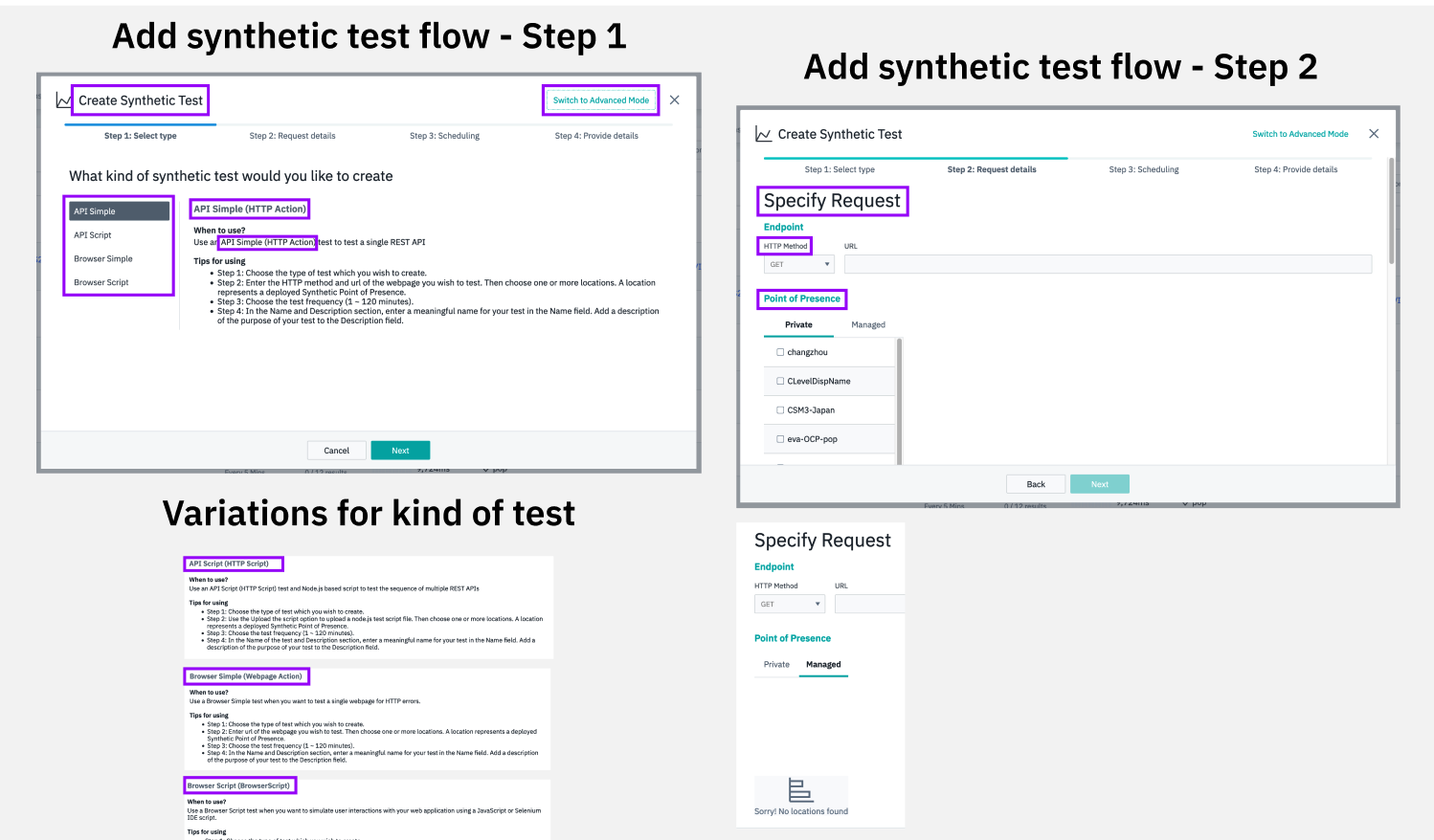
As I was working through the UI section audits, I started seeing a lot of inconsistency and significant content problems with some of our task flows, primarily around creating things in the UI. I had ideas about how we could rework these patterns (both content and UX) and started logging thoughts on improvements but it was a lot of work and I wasn’t sure if or how it could fit in the overall process. It did end up coming in handy though as the UX team started reworking our larger, common patterns, the create flows was one of the first. Luckily they asked me to review content before the proposed new flows got to Hi-Fis.
Hannah Bathool, a wonderfully thorough and thoughtful UX designer on the Carbon team, was assigned as the lead for overhauling our create flows. They needed to be Carbonized, but the team also wanted to try and improve the user experience and consistency at the same time. As I starting working through the content reviews, I noticed that some of the same issues and questions kept coming up and I realized that our Carbon guidance either didn’t address some content areas or it was vague, allowing teams to interpret or make decisions on how to present content themselves. How to write button labels was one example. There is lots of guidance around using action verbs and keeping labels as concise as possible, but in Instana, many labels also included whatever it was you were creating, for example, Create synthetic test. As teams started Carbonizing, some designers used Create and others kept the longer labels, so we really started losing consistency. We needed an additional level of content guidance, beyond Carbon, for Instana specifically.
I started documenting these issues and then met with Hannah and the Carbon leads to present my suggestions for how we should align. We went through a few rounds of review and discussion and then made the guidance available in Box for the team to use as a reference. We want to test it out for a bit and then find a more permanent home and share out with the rest of the teams in our portfolio and hopefully roll some of the changes up to Carbon, where appropriate.
Early audit notes and ideas for improving create flows:


A couple examples from our first release of the guidance:

