Developing in-product guidance:
WalkMe | Learn more | Side panel
Summary
When I started on the Cloud Pak for AIOps team as a content designer, WalkMe was gaining traction as a tool for providing in-product tours. Our product embraced a lightweight, while comprehensive, implementation. At the same time, we explored additional routes for including in-product guidance in an effort to provide both tours and more static options that would appeal to a wide variety of users.
Problem & user needs
With a complex and rich-in-function product, it can be difficult to get users oriented without some getting started guidance. Not all users like guided tours, especially those that rudely interject themselves into your workflow. It can also be difficult to remember pertinent information in a tour once you’ve completed it. We needed to find learning options that would work for our product and allow us to apply a consistent strategy.
Role
Lead (solo) UX content designer, working primarily with the UX design lead for Product-Led Growth (PLG) and a handful of other UX and visual designers on Cloud Pak for AIOps & AIOps Insights
Key contributions
WalkMe
Partnered with our UX lead for WalkMe to identify and prioritize potential on-boarding flows.
Refined and wrote content for product tours throughout our UIs.
Conducted content reviews and facilitated feedback sessions to improve copy.
Tested and updated tours for content and cadence with potential users.
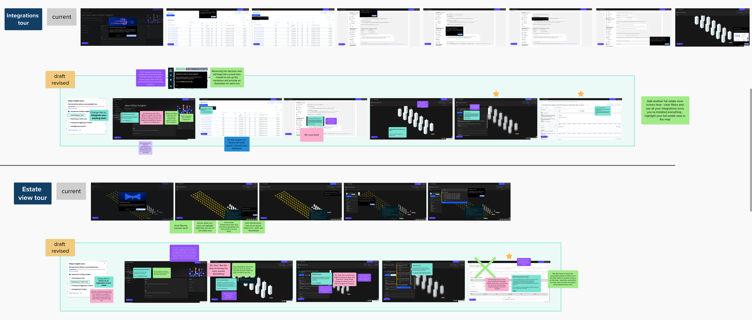
Reworked the tours in our trial experience to be more narrative (AIOps Insights).
Learn more
Ran Mural working sessions to asses gaps and overlaps for the different types of guidance we had in the product.
Worked with UX leads across the product squads to identify areas that could benefit from the inclusion of a Learn more pattern.
Drafted and refined Learn more content across the UI.
Reviewed and reworked content to ensure that Learn more would compliment our WalkMe tours where both appeared.
Met with other teams to share our pattern and implementation for Learn more.
Side panel
Worked with UX and visual design leads to vet different layout designs and rework structure based on feedback.
Drafted copy in different formats to see which worked best.
Conducted content reviews with development, ID, and architects to verify we had the right details.
Reworked copy and terminology for AI model management panels based on feedback from users.
Outcome & impact
Over time, we developed a series of patterns across the Cloud Pak for AIOps and AIOps Insights UIs to present information in multiple formats, giving users access to different types of in-product guidance to orient them, deep dive on concepts, and provide detailed instruction where needed.
The story
WalkMe
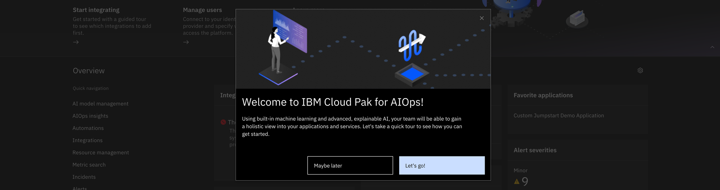
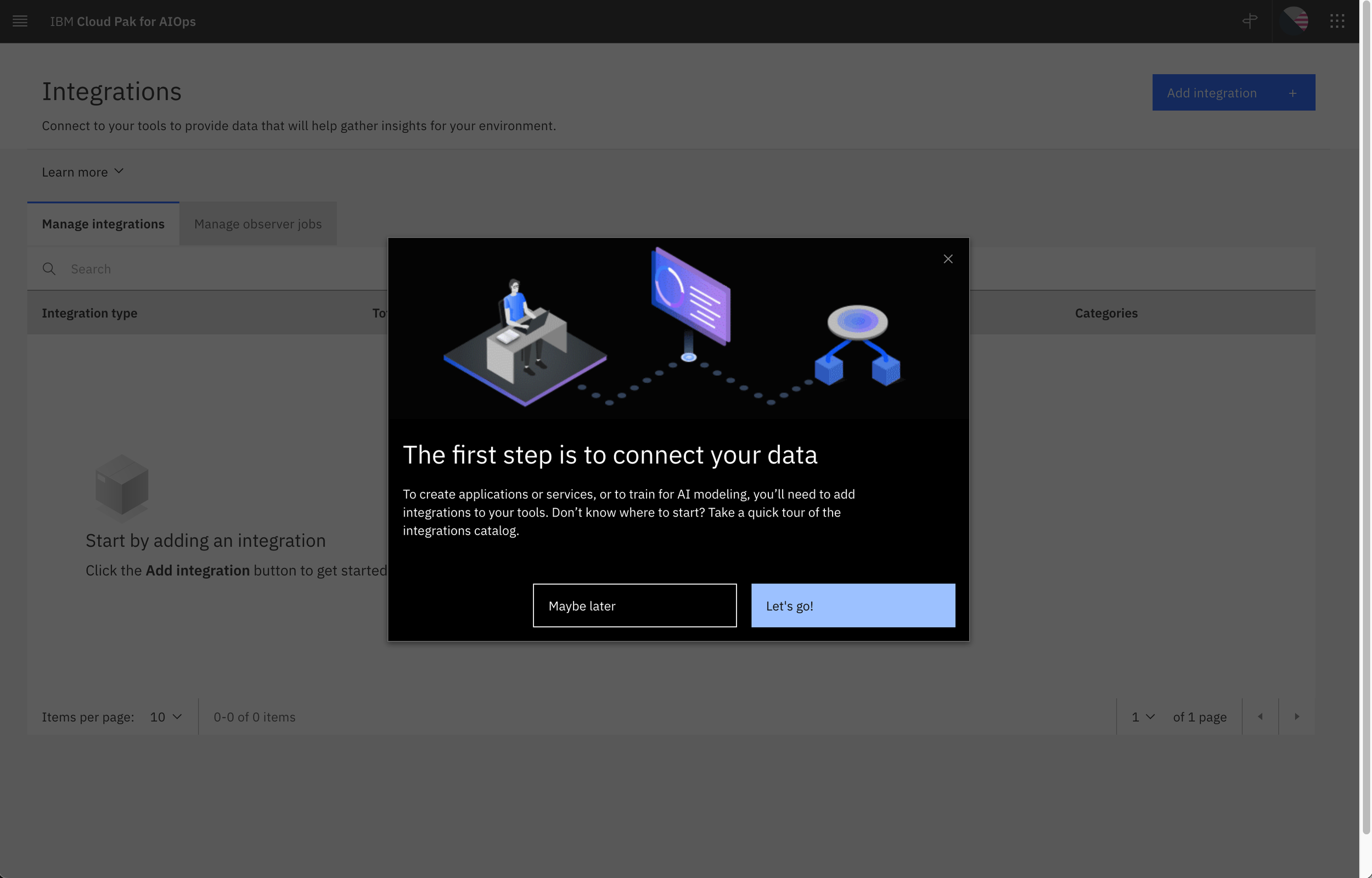
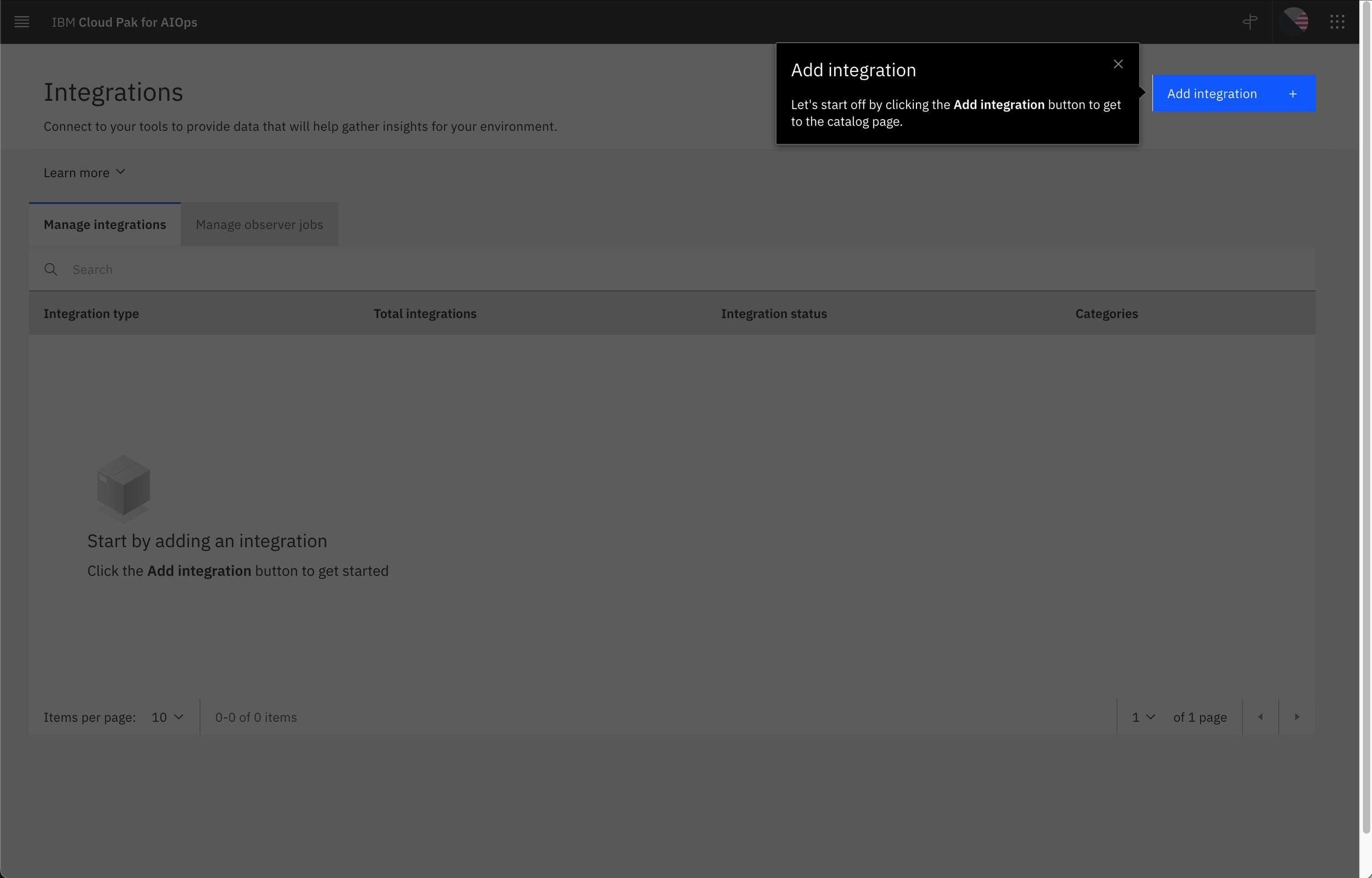
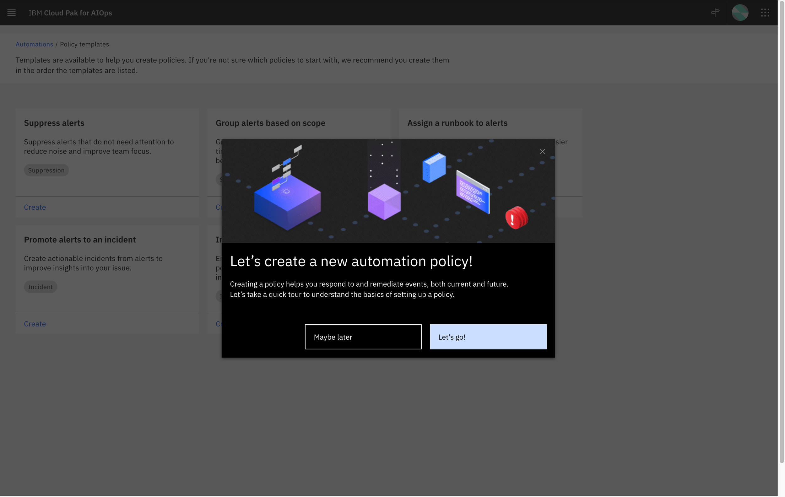
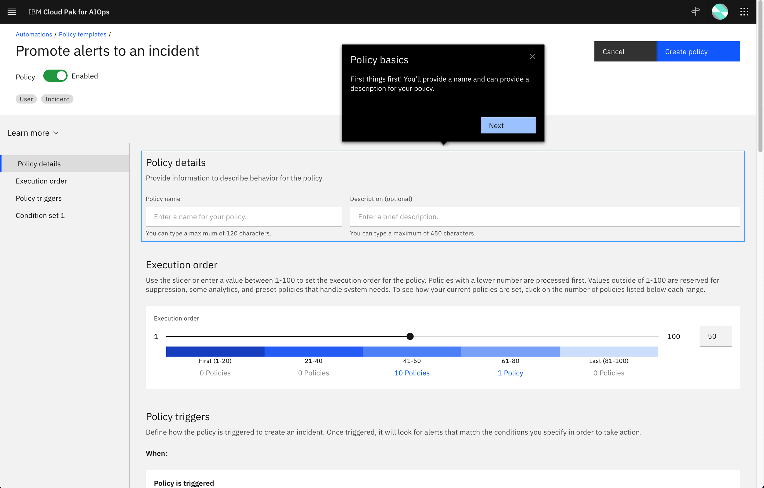
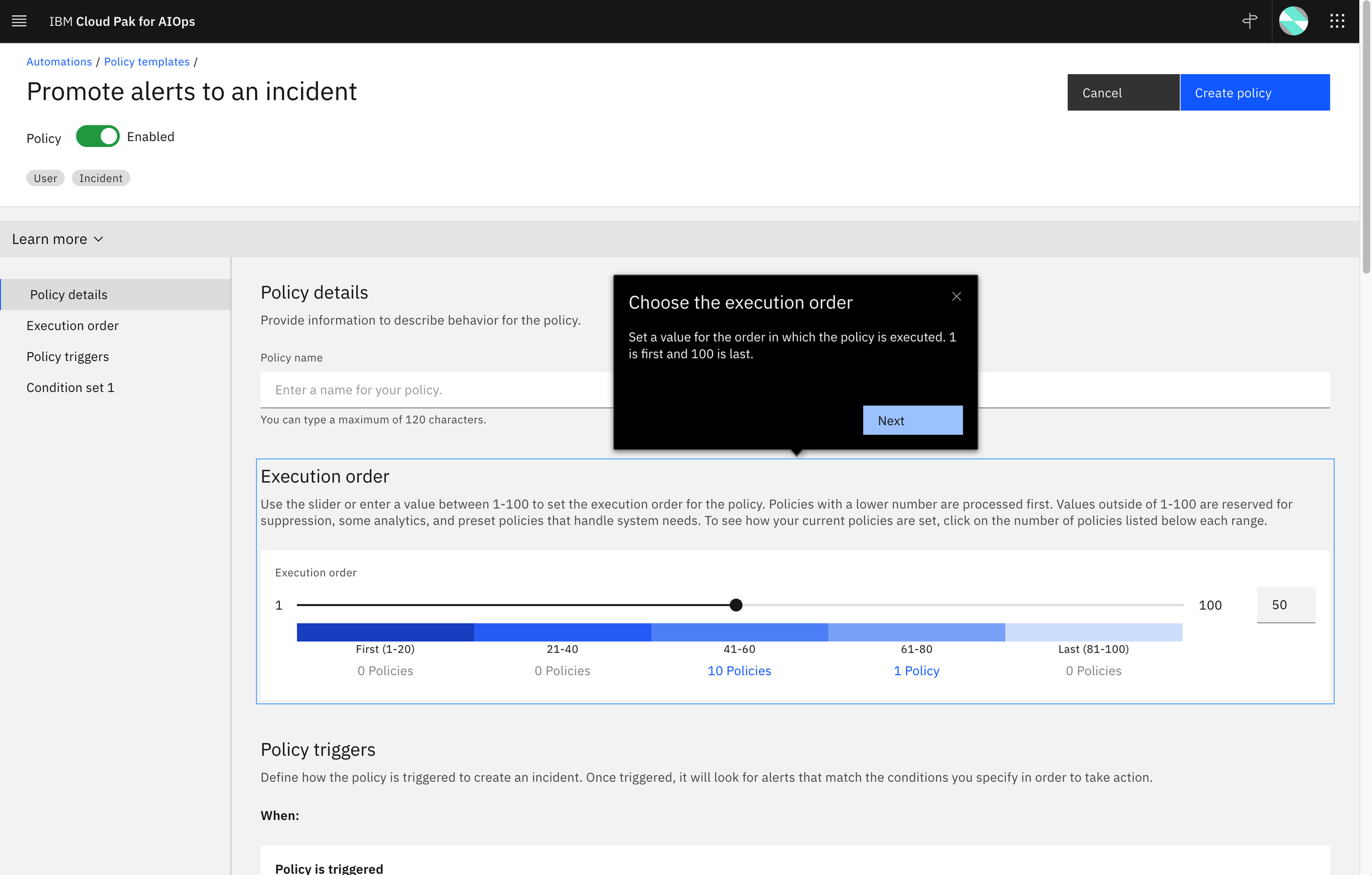
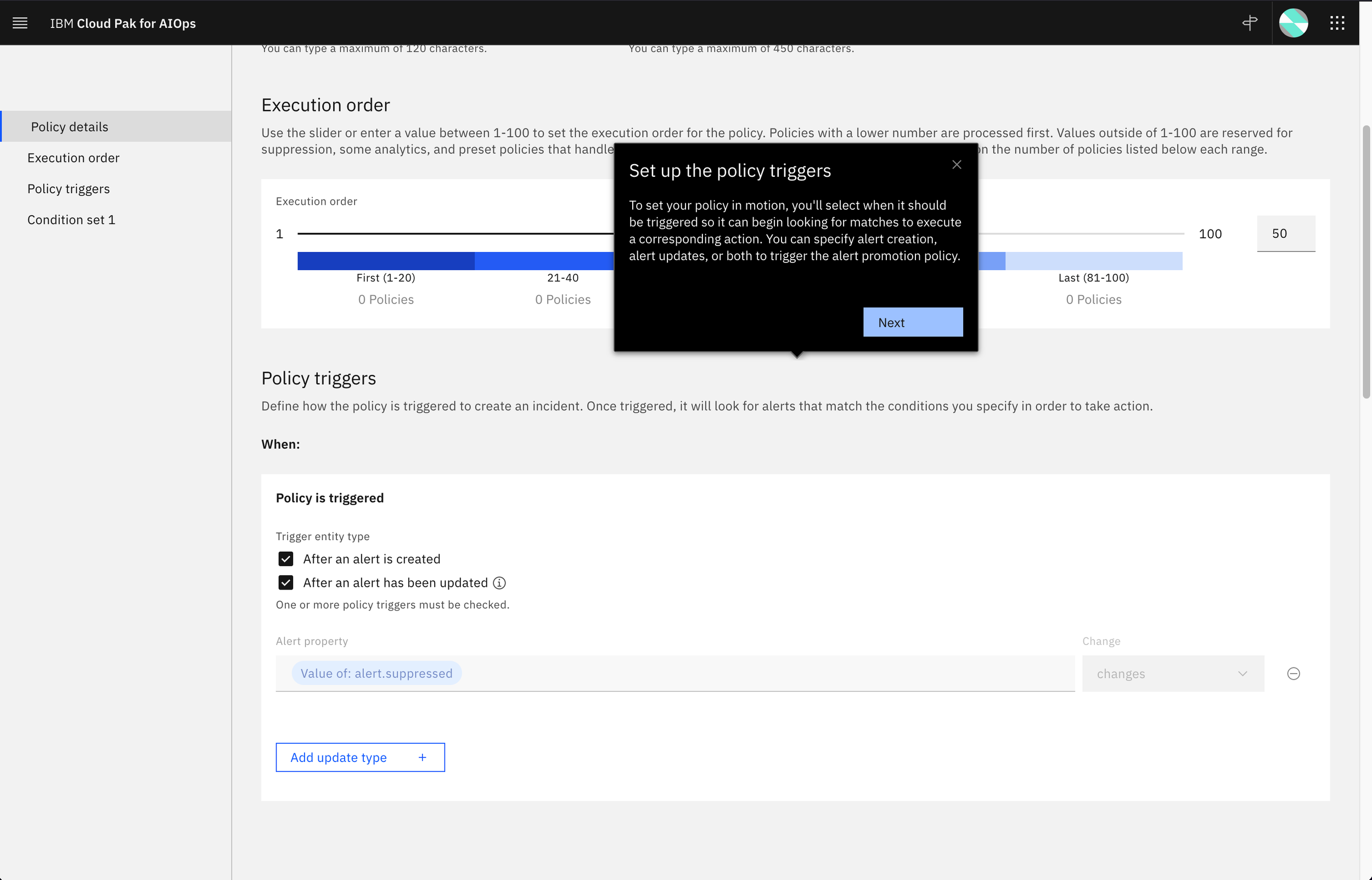
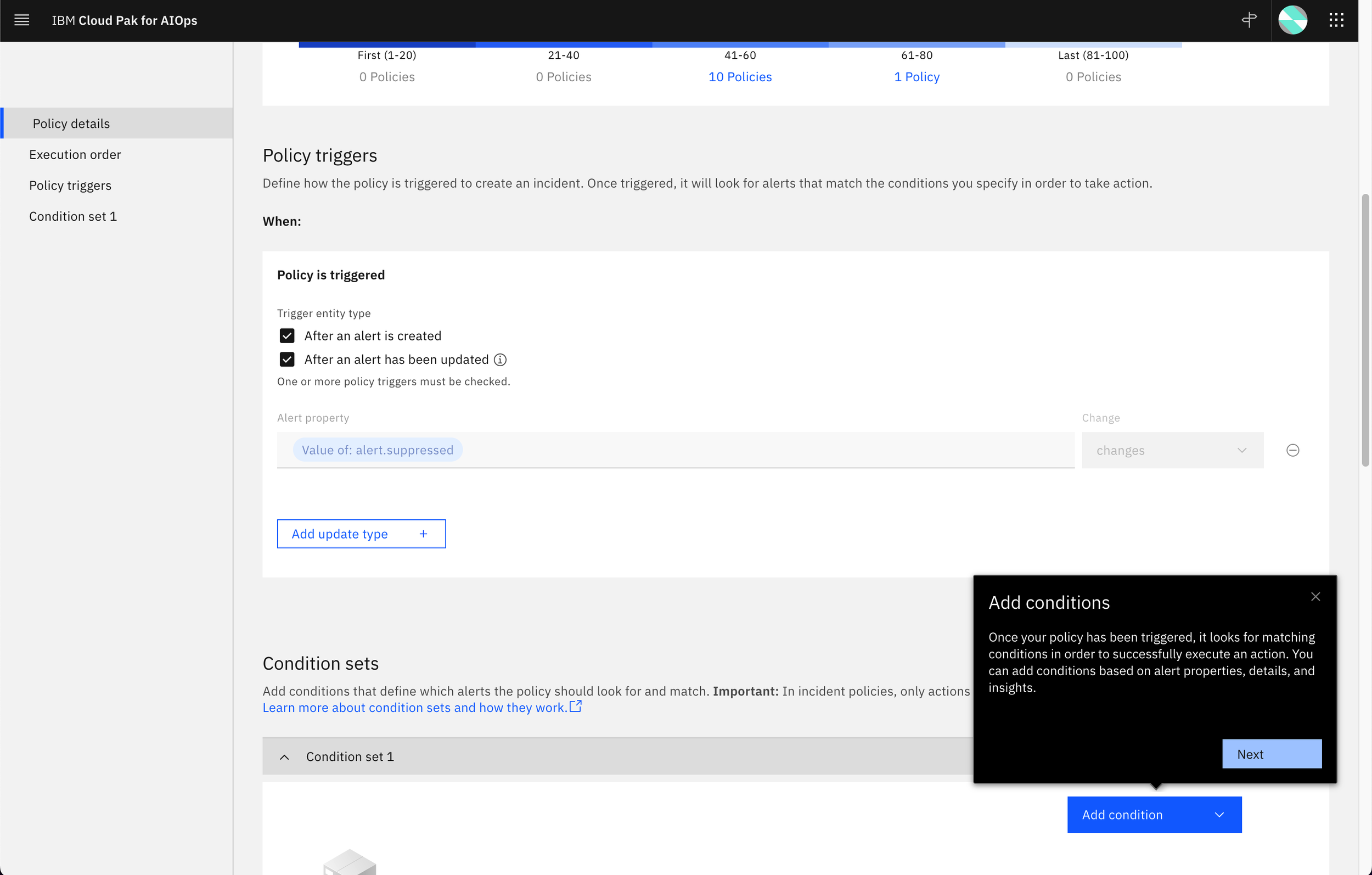
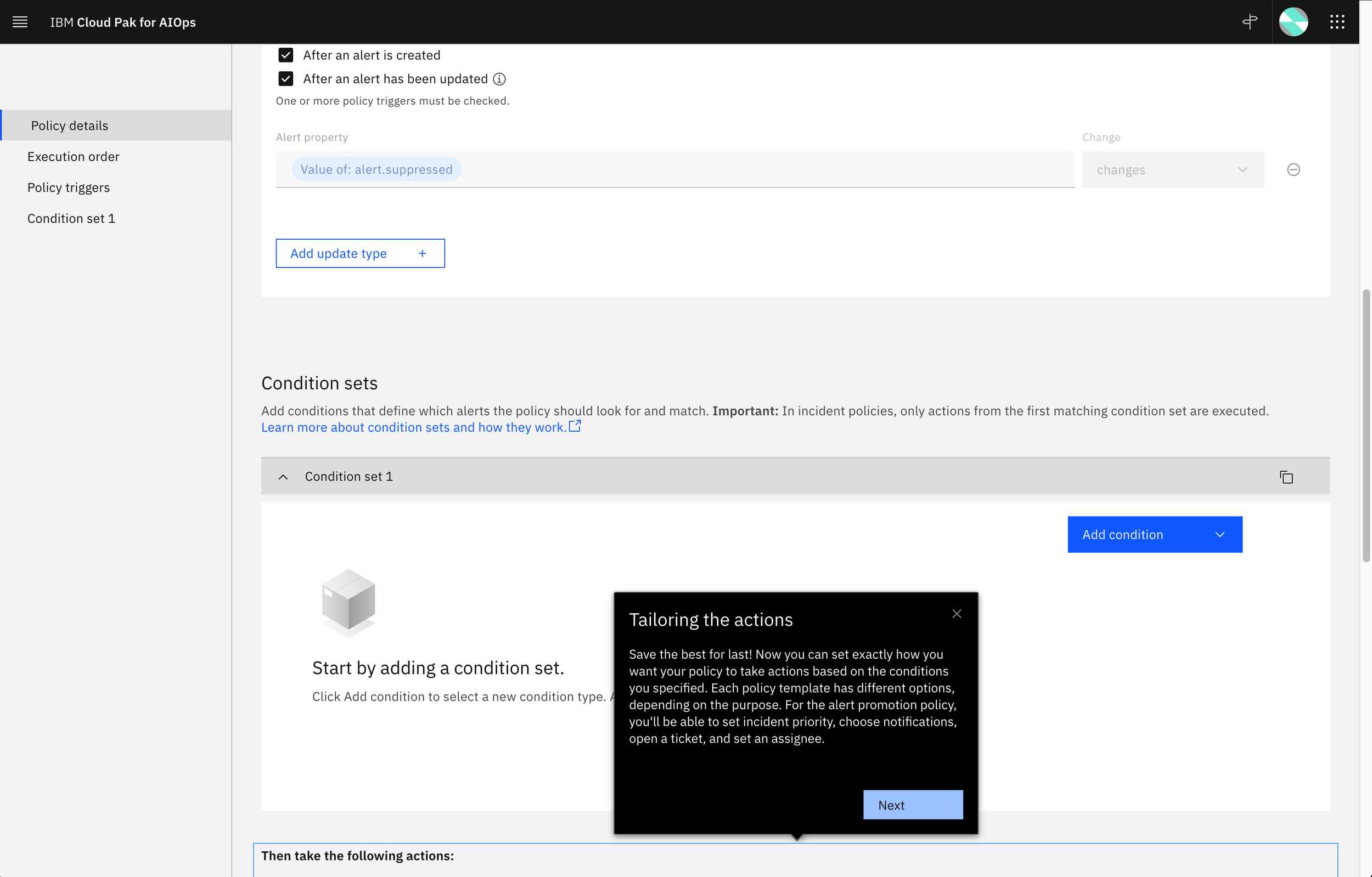
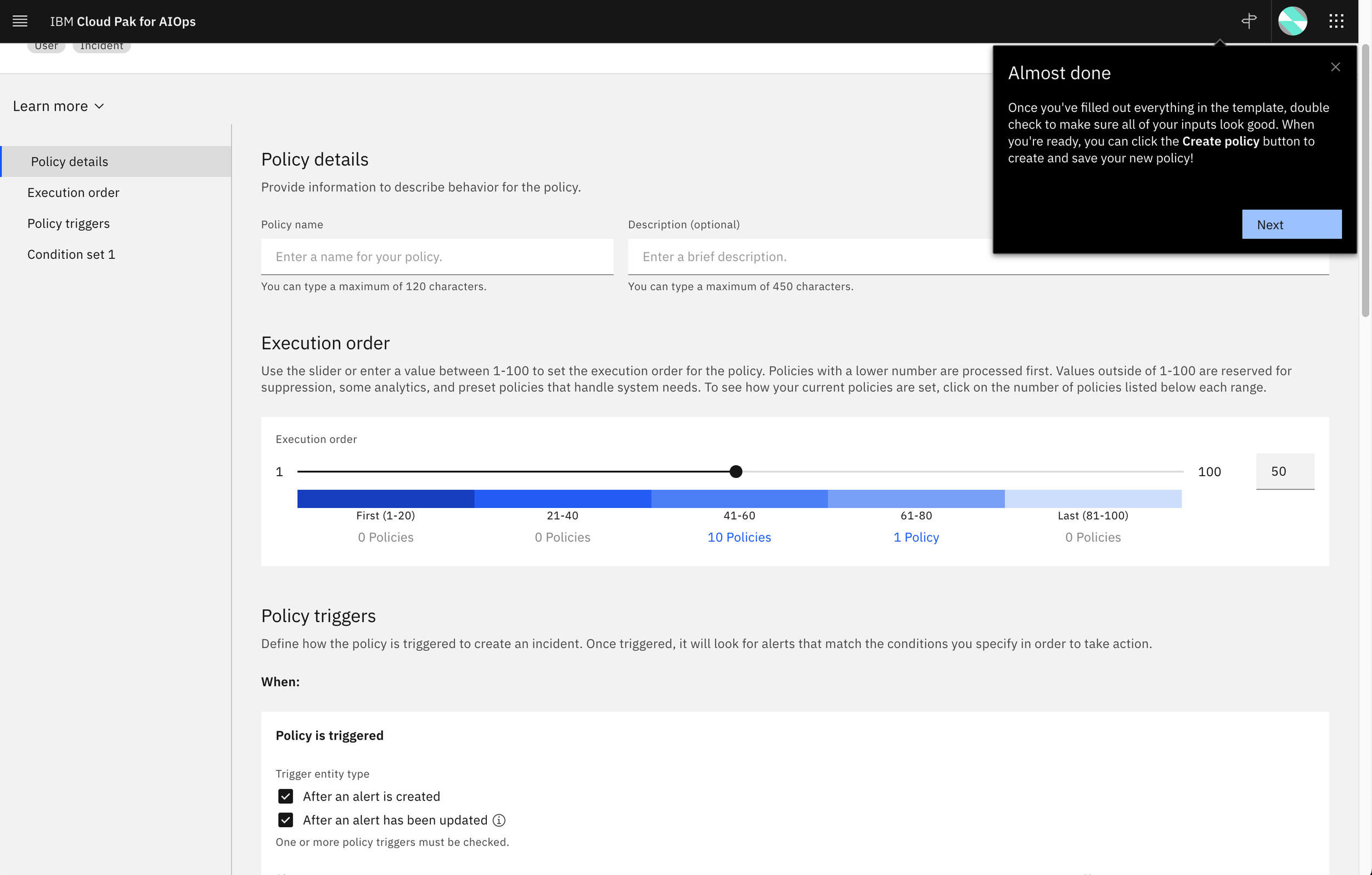
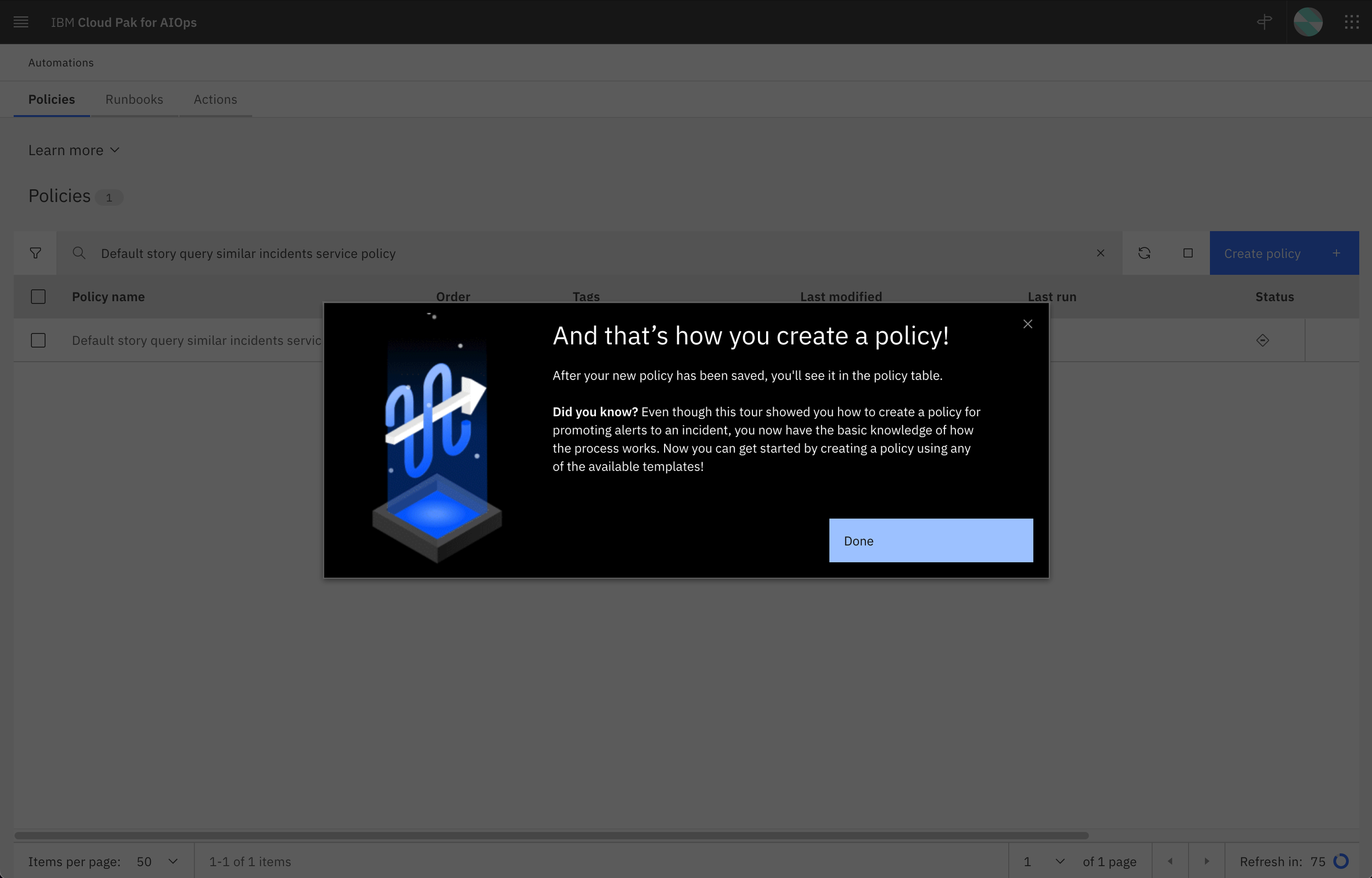
In late summer 2020, I first met with Emily Kim, who had just joined the quickly forming Cloud Pak for AIOps team. Her new role was WalkMe UX lead and as the content designer on the team, I would be working closely with her on product tours as they would be content heavy. Emily set up a couple of WalkMe workshops to determine where we wanted to include tours in the product, what kind of tours we wanted, and how we could prioritize them since she would be owning the design and UX across the UI. After several discussions with the wider team and working through the first few tours, we got a good cadence going: Emily designed the tour flows based on working sessions with the UX leads and took a first pass at draft copy and then I came in to review, provide feedback, and refine content. We worked back and forth on tour sequence, content to cover, and details for each step. The process worked well, and within a few releases, we had added at least one tour for every landing page in the UI.
Once we had our tours established across the product, we needed to be mindful of new features coming in and whether updates were required. Emily did a stellar job of reviewing flows with the UX leads for each release to understand any impacts. As the content designer working across the product and being familiar with all of the tours, I was also able to help assess when tours might need to be updated based on seeing what was new across the squads. We also continually refined tours based on QA assessments and user testing. Some things we dug into with users were trying to determine the right sequence of WalkMe steps and how users responded to the amount of content we had in each callout of the tour. In addition, we also looked at developing new tours for larger features or capabilities we wanted to highlight to users as time permitted.
Emily and I formed a very successful UX/content partnership that has persisted through three products. We’ve worked on both overview and task tours and have established a seasoned review process to vet new tours and content with designers, stakeholders, and users.
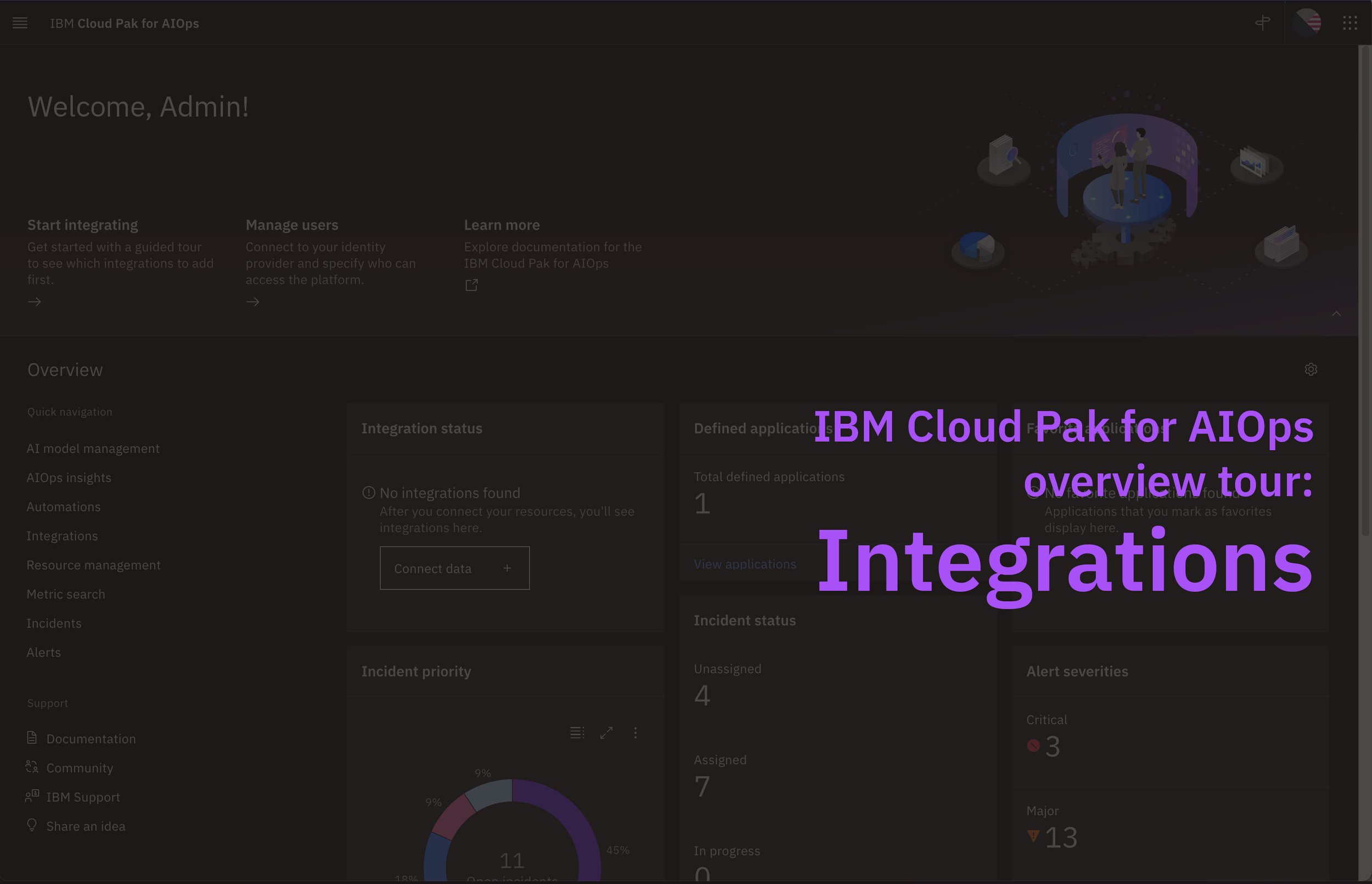
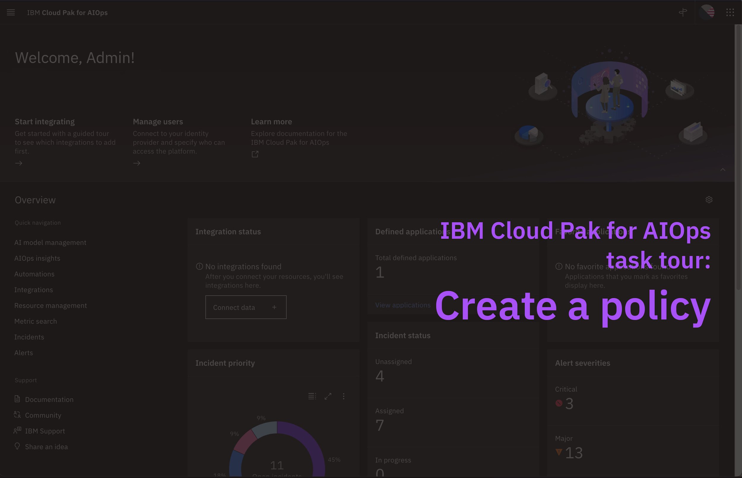
Overview and task WalkMe tours from Cloud Pak for AIOps:
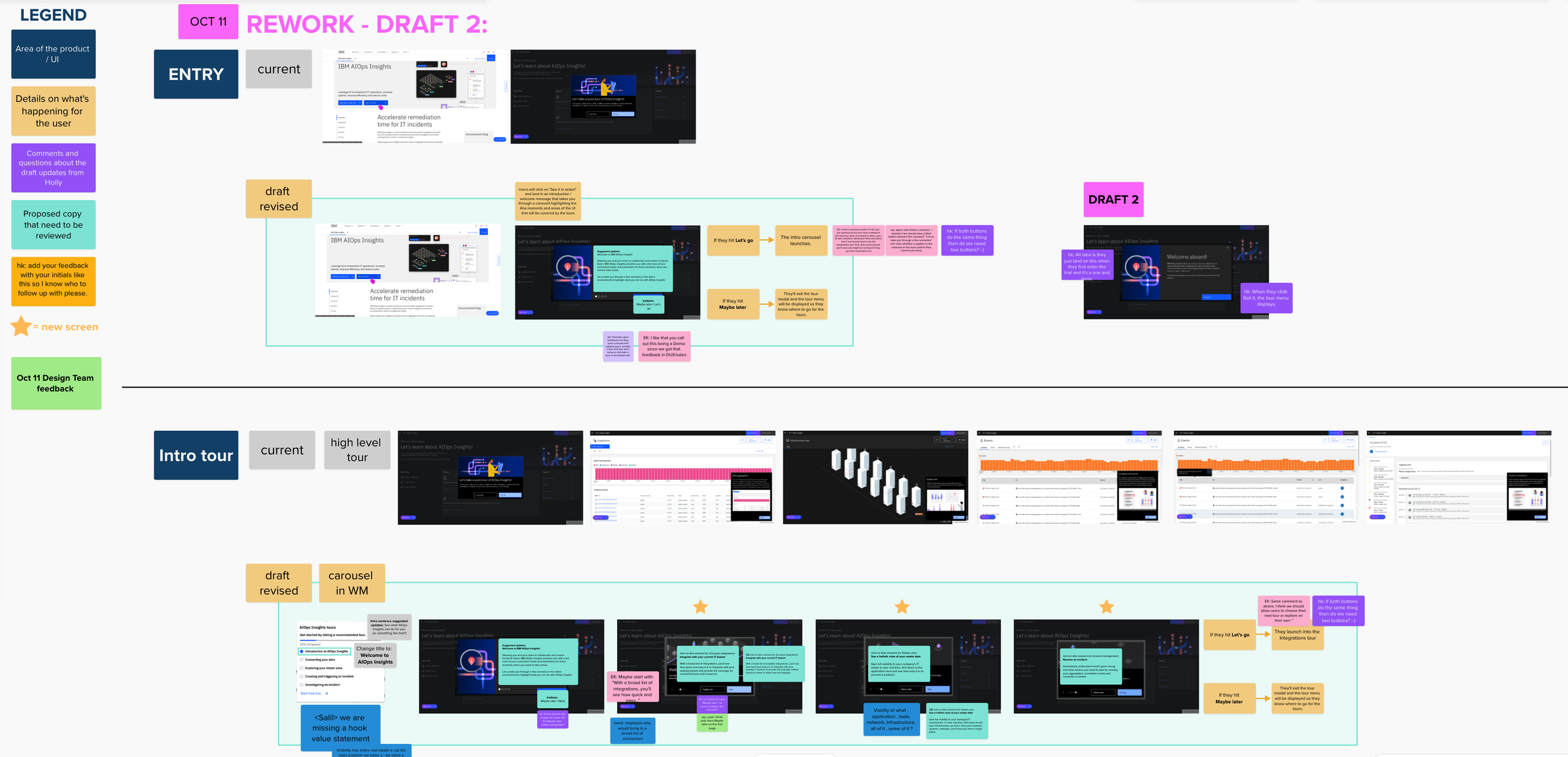
Review Mural for reworking our AIOps Insights tours to be more narrative:
Learn more
After starting to implement WalkMe in the product, the UX leads and I noticed that it didn’t fill one need for users: persistent, lightweight guidance information directly on a page. We began to think about how we could address this problem and eventually settled on a Learn more component that would be expandable and help orient first-time users. It would also serve as a handy reference for subsequent visits while utilizing progressive disclosure to minimize the real estate used.
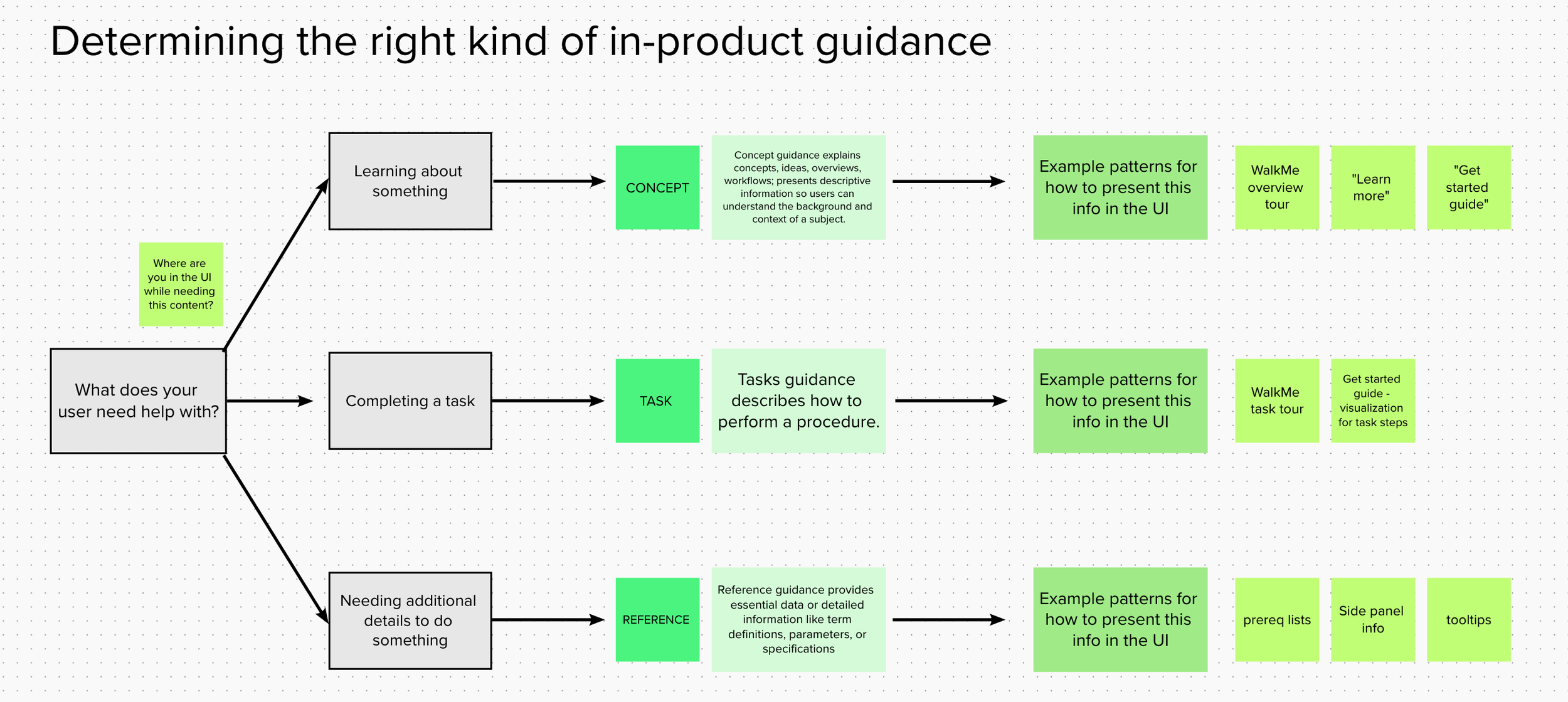
Our goal for this effort was to compliment our WalkMe tours and not repeat information that users could find there. We wanted to consider different preferences for learning and present something static on the page so users would not have to navigate away from their current view. I set up a couple of working sessions to try and determine the content we needed and if Learn more was a pattern that would fit well. We made it a priority to ensure that our in-product guidance types weren’t overlapping too much. As part of that effort, Emily and I drafted some guidelines for UX designers to consider when including in-product content to ensure consistency and quality.
In-product guidance workshop: UI assessment to determine where we had & needed guidance for users:
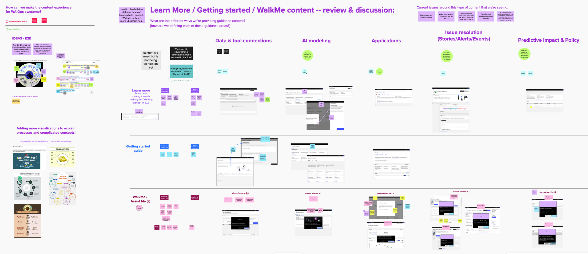
In-product guidance workshop: Deep dive on types of in-product guidance that might help users in the UI:

Decision tree to help teams decide which kind of in-product guidance might work best:
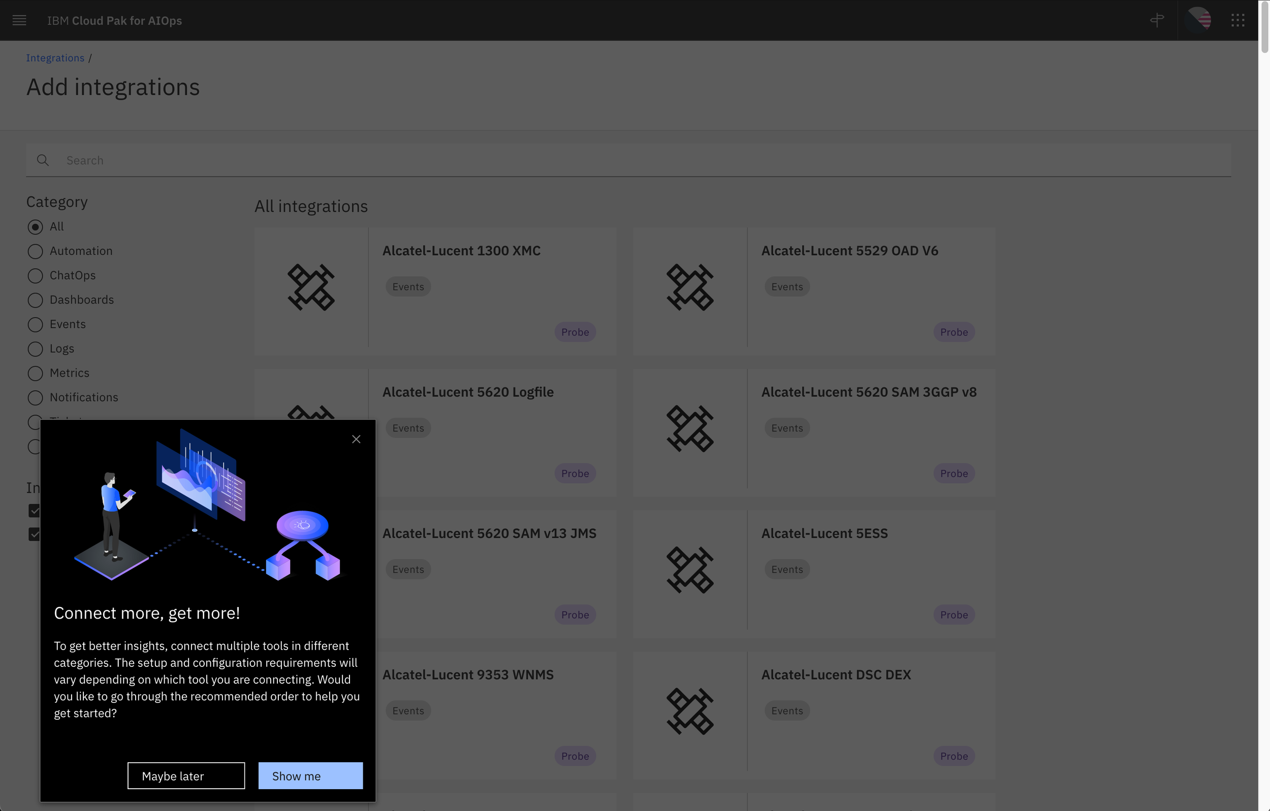
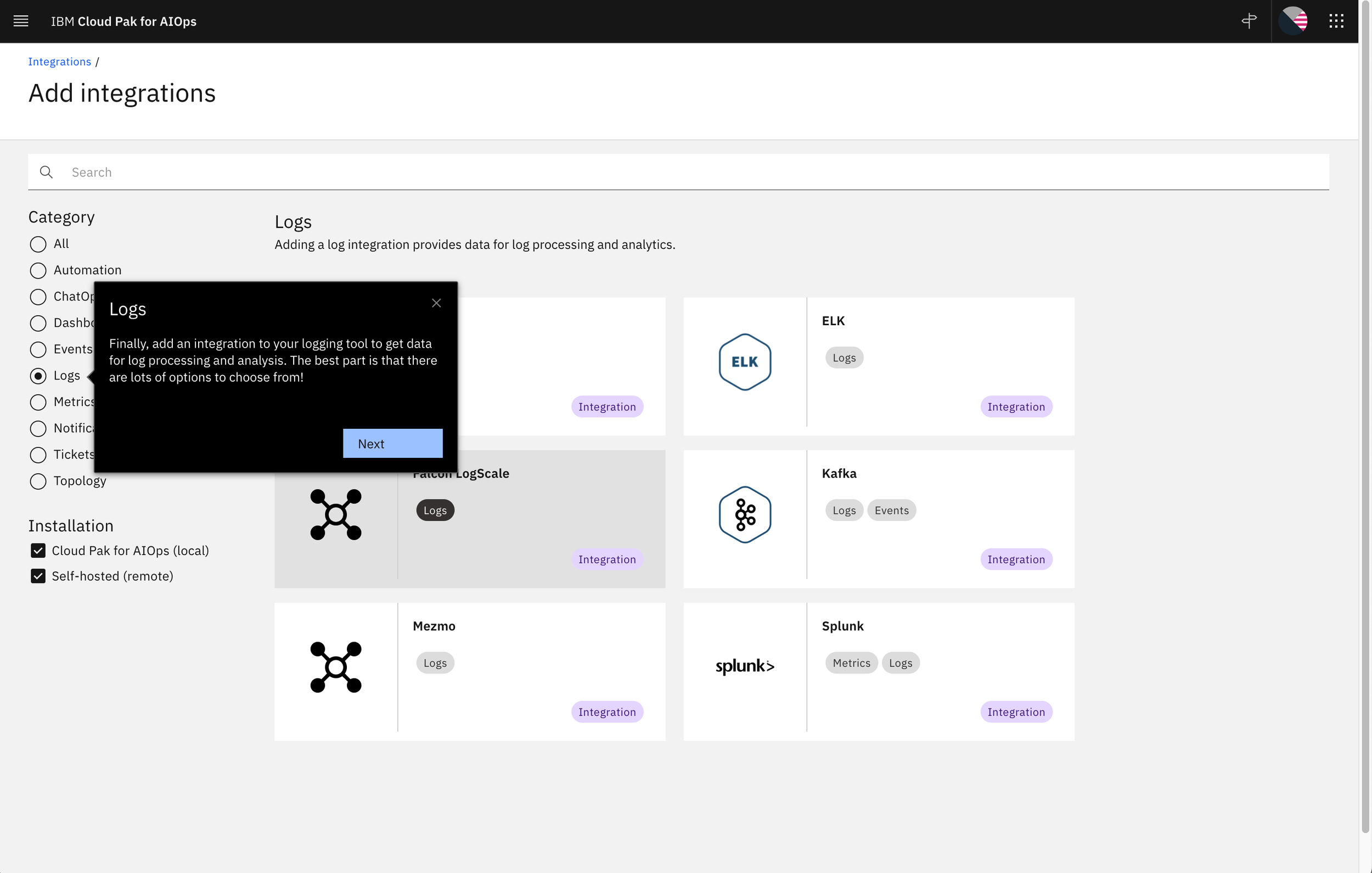
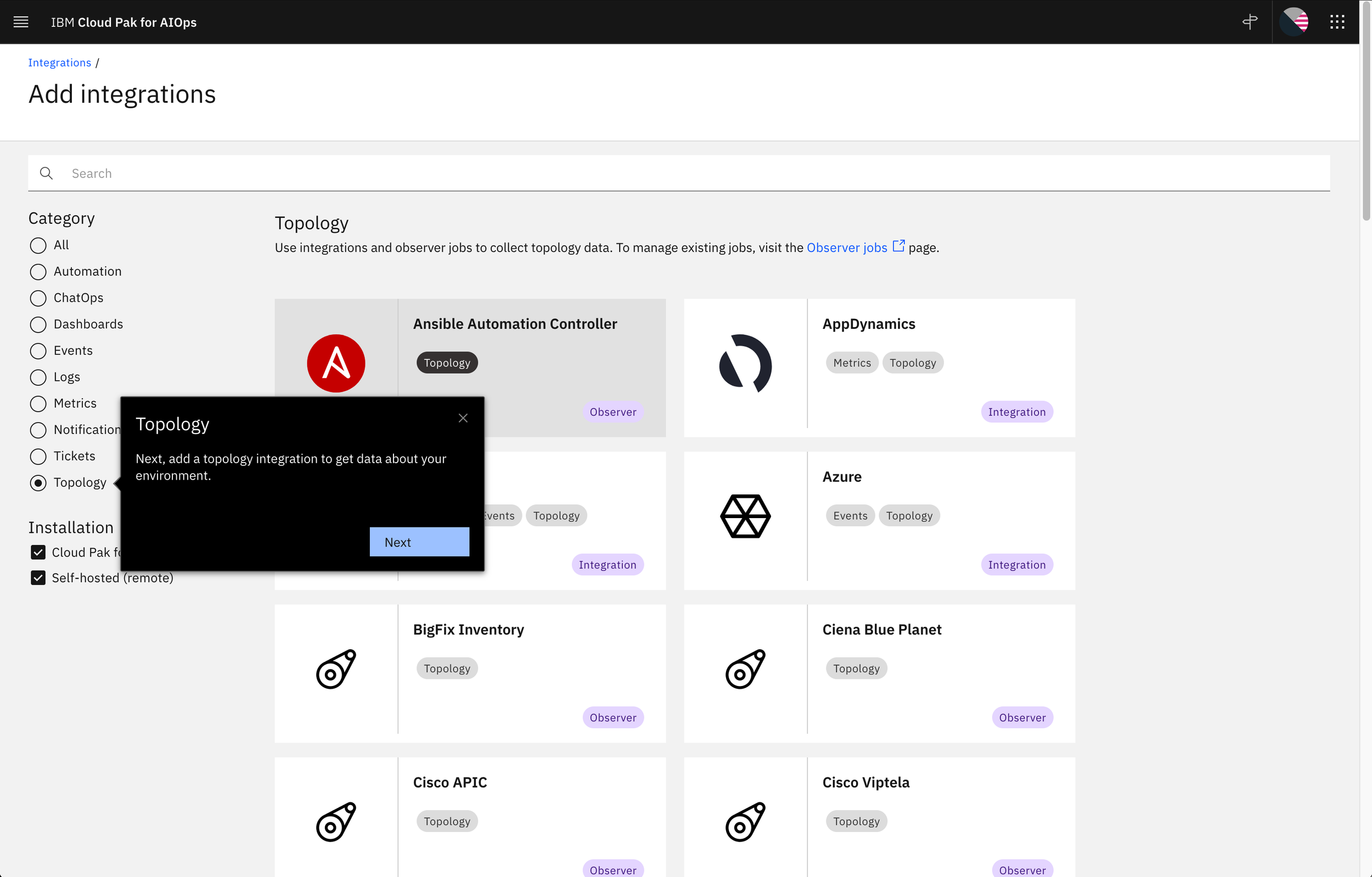
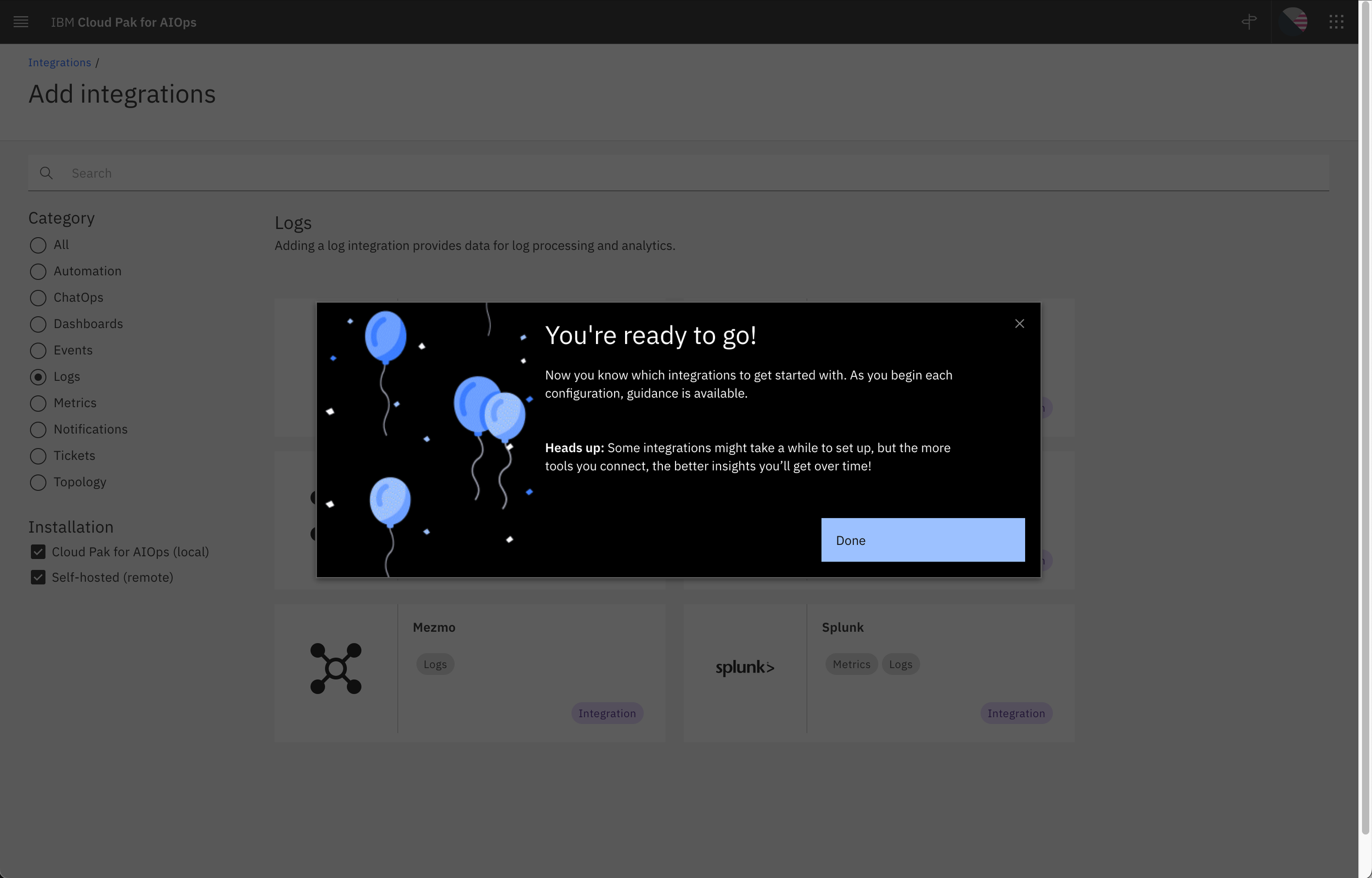
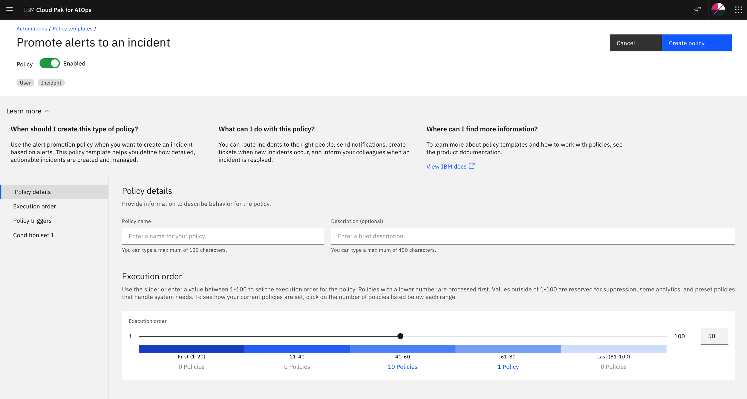
After vetting our Learn more idea, we settled on a three-question format and started making plans to include it in main landing pages across the UI. Our visual team explored submitting it as a formal pattern to the Carbon Design System and we met with several other teams to show how it worked.
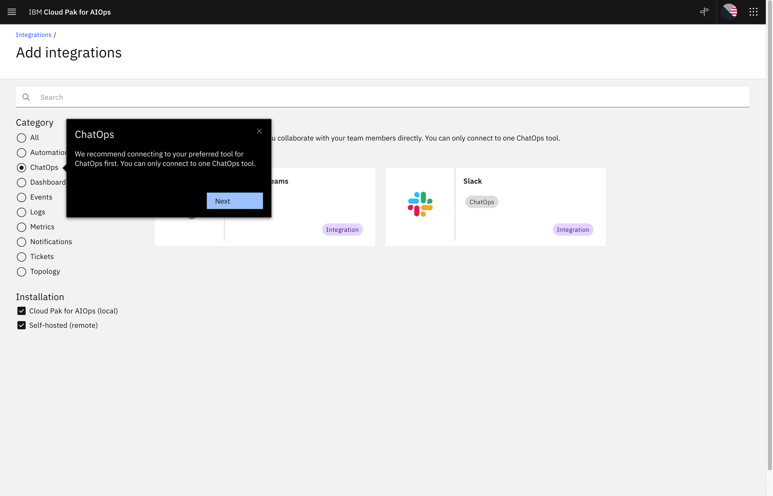
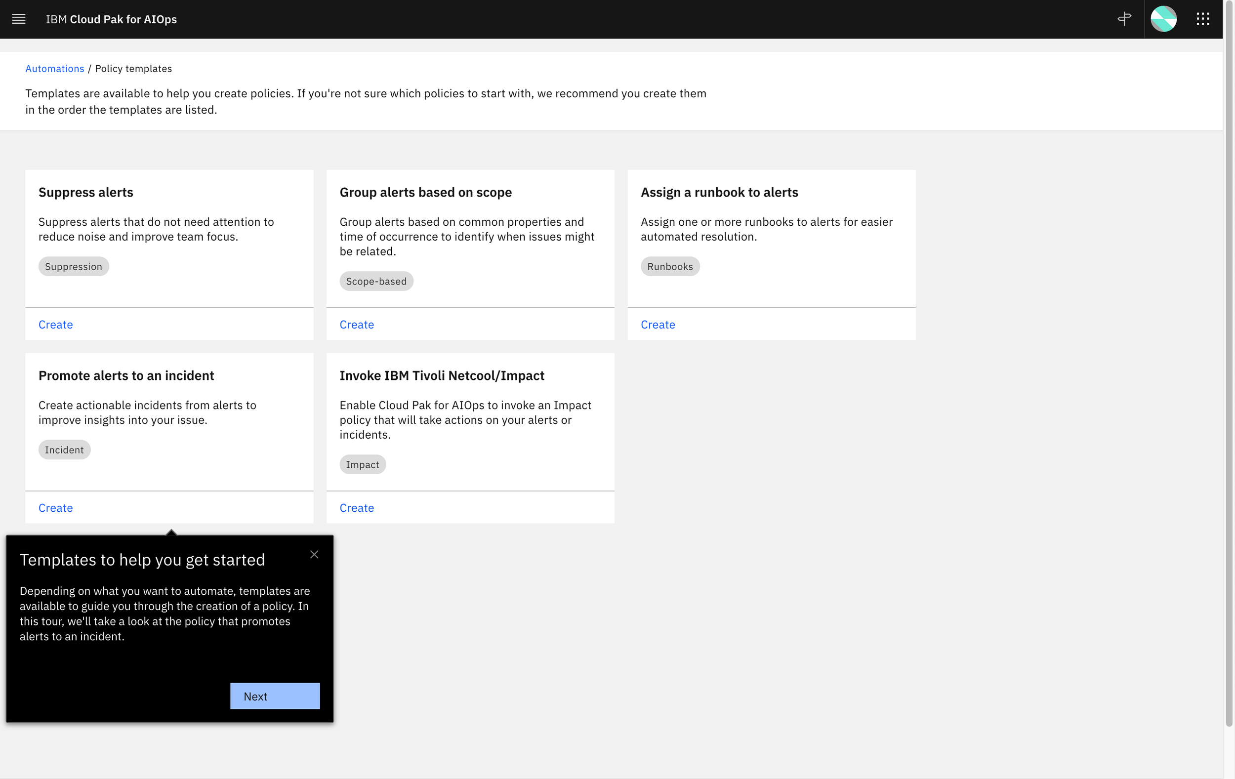
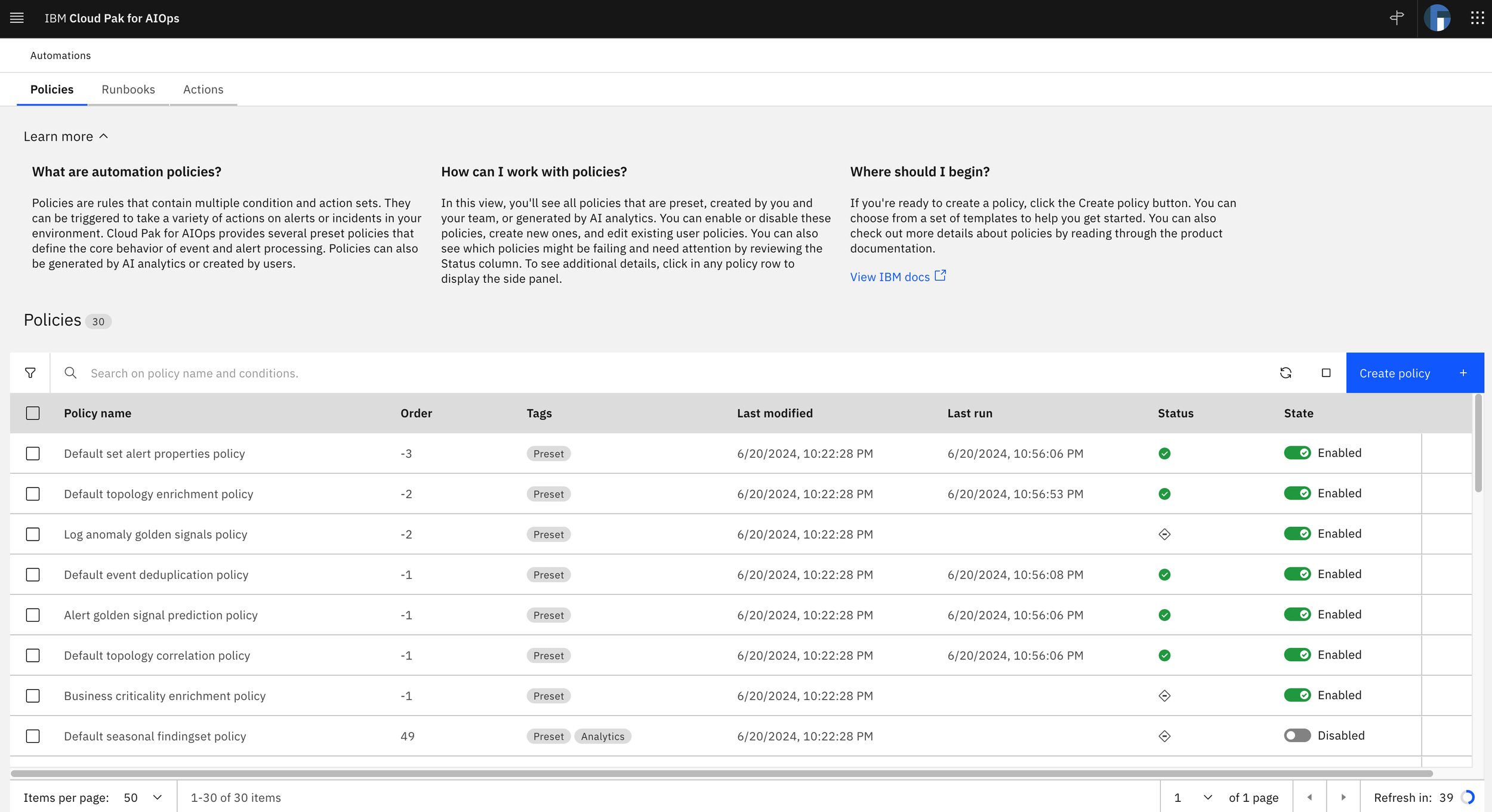
Learn more in Automation policies is two levels deep. We have information on the landing page as an overview for all of Policies and then a section within each policy template as well:
Side panel
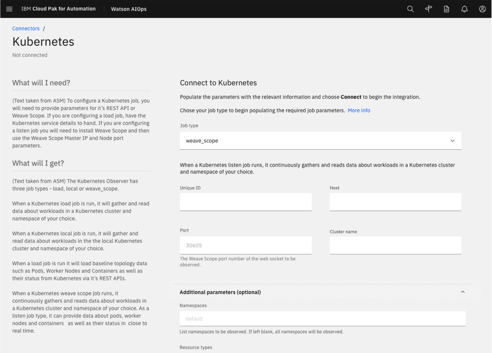
The side panel concept started with some information in one of the existing products we were starting to fold in to Cloud Pak for Watson AIOps. There was a somewhat buried blurb in the tool configuration forms that detailed “what should I give” and “what will I get” by connecting to different tools to bring in data. The concept was good but I thought had one glaring issue: the information seemed to come a little late in the game. I thought it would be much more helpful if users could get access to these details prior to landing on the actual connection form so they’d have time to gather the necessary information for a smoother set up. In the as-is, the user needed to select the tool first and then they would see these details but I pushed for moving it out of the connection form entirely and placing it earlier in the flow. We somehow needed to tie it to the catalog page where they were deciding which tools they wanted to connect.
Original design for “give and get” information in Connections (later Integrations):
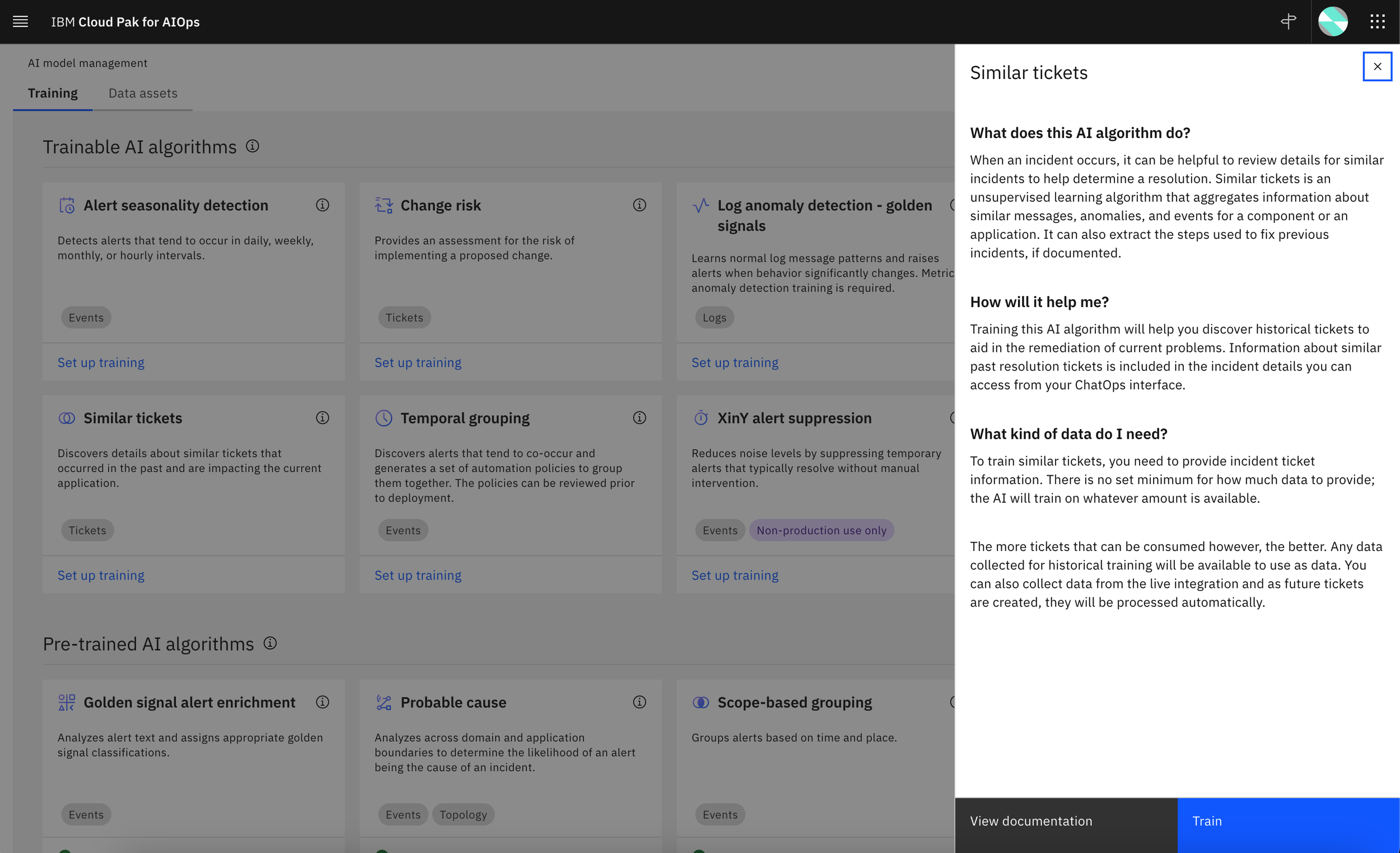
I worked with the UX designers to explore how we might be able to provide this info earlier and we settled on a side panel design that would be triggered from an info icon on each tool tile in the integrations catalog. We adopted the same pattern in AI model management where we wanted to provide more in-depth details about our AI algorithms and why users might want to set up training. We later modified the design for integrations to remove the icon and show the side panel as essentially the first step because the information covered prerequisite-type details that users would need to successfully complete a connection. In AI model management, the information was more supplemental and educational, so we elected to keep the side panel trigger in the icon.
Reworked design for integrations, utilizing the side panel:

Side panel information to help users decide if they want to train the Similar tickets algorithm in AI model management:
Next: Aligning terminology