
Auditing a content landscape
Summary
IBM Cloud Transformation Advisor is an assessment tool that helps you determine the effort required for moving Java applications to different cloud environments. As a product without content support, the available information was disorganized, inconsistent, and often left users without many resources for learning about or using the product.
Problem & user needs
In the early days of Transformation Advisor, the development team was small and had struggled to produce information about the product. They did not have dedicated information development (ID) support, so a handful of developers, subject matter experts, and technical engagement folks had created most of their content. This content was available across several locations including blogs, articles, videos, and a GitHub-generated documentation site. When I joined this team as my first embedded UX content designer experience, the UX around content was a known issue, so diving into a content audit as one of my first ventures seemed like a no-brainer.
Role
Lead (solo) UX content designer working with the design and development teams.
Key contributions
Researched content for Transformation Advisor across all publicly available IBM locations.
Created a Mural to capture the content landscape and assess each piece from blogs to documentation to videos.
Synthesized analysis to identify major pain points for users and brainstorm ideas for how to address them.
Engaged with stakeholders to present the findings and make suggestions for tangible actions.
Developed and help execute a plan to improve the content experience.
Outcome & impact
Identified a prioritized list of actions to tackle for content improvements, including the consolidation and deprecation (where applicable) of existing resources to reduce repetition and contradictory information. Following the audit and a bit of rework on the Transformation Advisor documentation site, the content experience was vastly improved. Users were able to quickly understand the value of Transformation Advisor as part of the overall app modernization journey and find the documentation and resources they needed from initial discovery phase through to support after product implementation. In addition, the quality and organization of concept and reference content was elevated.
The story
Setup and content gathering
To get started with the audit, I began gathering content. My UX content design colleague, Tom Waterton, had already created a really nice audit template in Mural which I copied. I wanted to be able to visually compare the different content sources, so Mural was an ideal tool to use. I started by screenshotting every blog, website, technical article, video page, and documentation location on the Mural board. It provided a good canvas to track detailed comments and observations about things like style, length, and content breakdown (text, images, links, composition).
This content audit template in Mural served as an excellent starting point:

Team input
I’d been working on the Mural for a few days in isolation and while it was not finished, I wanted to get input from the rest of the design team and involve them in the process. We had a call to go over the purpose and to review the info that I’d gathered so far. It was great to get thoughts from the team - they helped me re-focus and we agreed on how to wrap up the work and what the next steps should be. I would finish filling out stickies for everything and then gather the pain points that we’d identified and start brainstorming ideas for how to solve them.
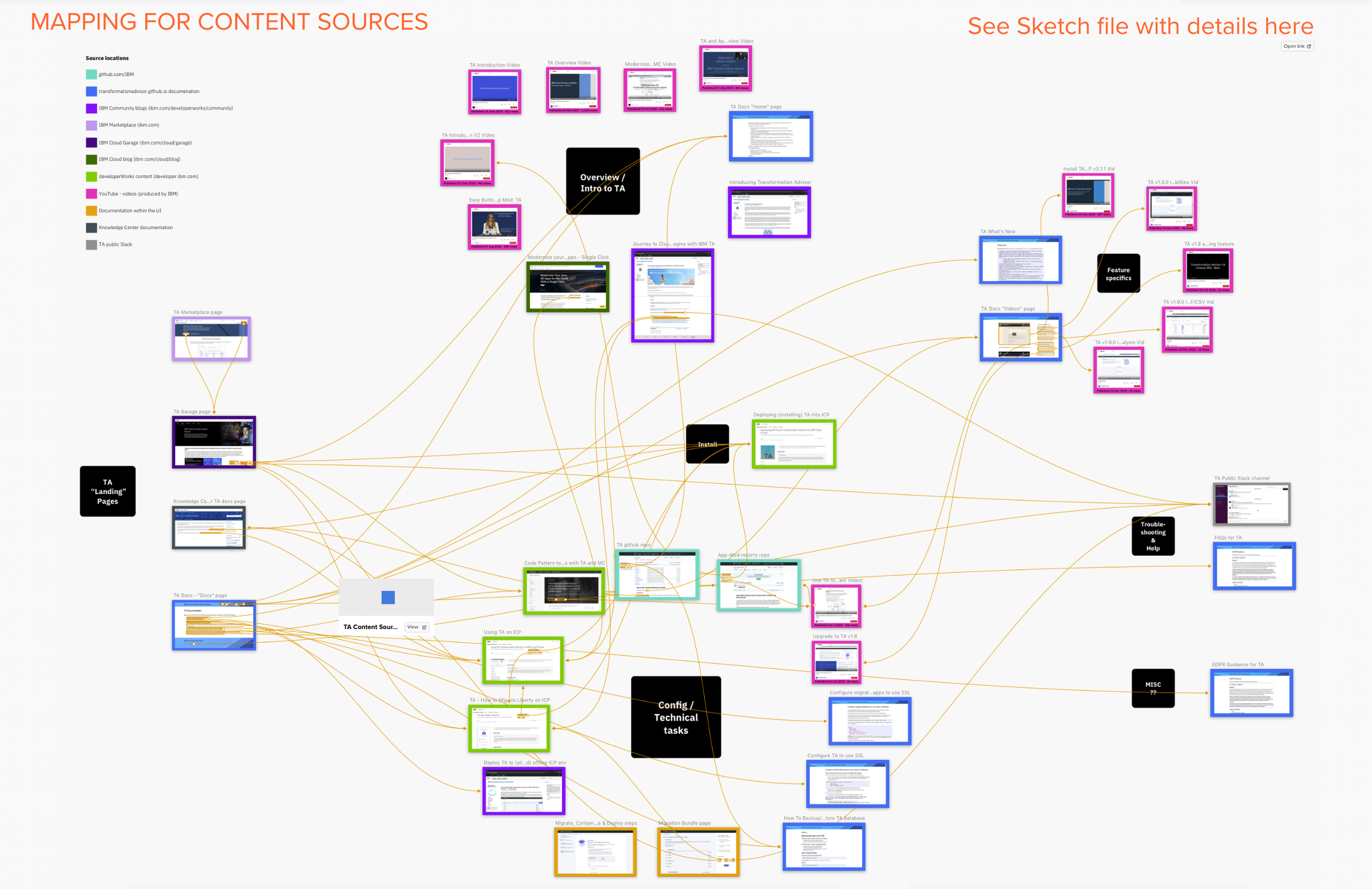
Content mapping
During the team review session, they asked if we could somehow map all of the content to visually show how the pieces were connected to each other. I thought this was a great idea but I wasn’t totally sure how to go about it. The most daunting aspect in my mind was figuring out how to visually show what was actually linked. I envisioned using my line tool of choice in overdrive, which didn’t really sound fun. Then I remembered that Sketch came out with a very simple prototyping feature recently, so I decided to try that to hook up the different pieces to each other.
It ended up working out beautifully and the resulting image showed us clearly that there were gaps in the content experience:
We found inconsistencies in how users could find content.
The path they would likely be taken down to complete tasks was confusing.
Overview information and the opportunity to learn about the value of Transformation Advisor was lacking.
For a product with a relatively small content footprint, sources were spread across many locations and presented in many different, disjointed formats.
Content map created in Sketch showing how each piece of Transformation Advisor content was linked:
Pain points
After finishing up the mapping exercise, I used notes from the team discussion and my own observations to summarize the user pain points for Transformation Advisor content. I added those details to the Mural so we’d have everything in one place and then started building a deck to share what we’d learned and figure out what we needed to do next.
While most of the issues were not a surprise to anyone, having one place to read through the user pain points and then see an actual example was really helpful. The audit also uncovered some problems that might not have been as obvious without comparing the content side-by-side.
Listing out the pain points uncovered by the audit and brainstorming on ideas to solve them:

After organizing the pain points and recommended actions, we were able to prioritize two main courses of action to address the majority of issues with Transformation Advisor content:
First, create a single entry point for the application modernization journey at IBM and provide guidance for discovery and exploration.
Second, come up with a plan for improving Transformation Advisor documentation. Our recommendation was to consolidate all concept, task, and reference information in one place, and then update topics to improve the quality and consistency.
Creating the Mural was a great way to illustrate how content is a part of every step in the user’s journey. By combing through each piece of content and recording findings in a single place, we were able to quickly identify gaps and shortcomings and come up with a plan to improve the experience.